

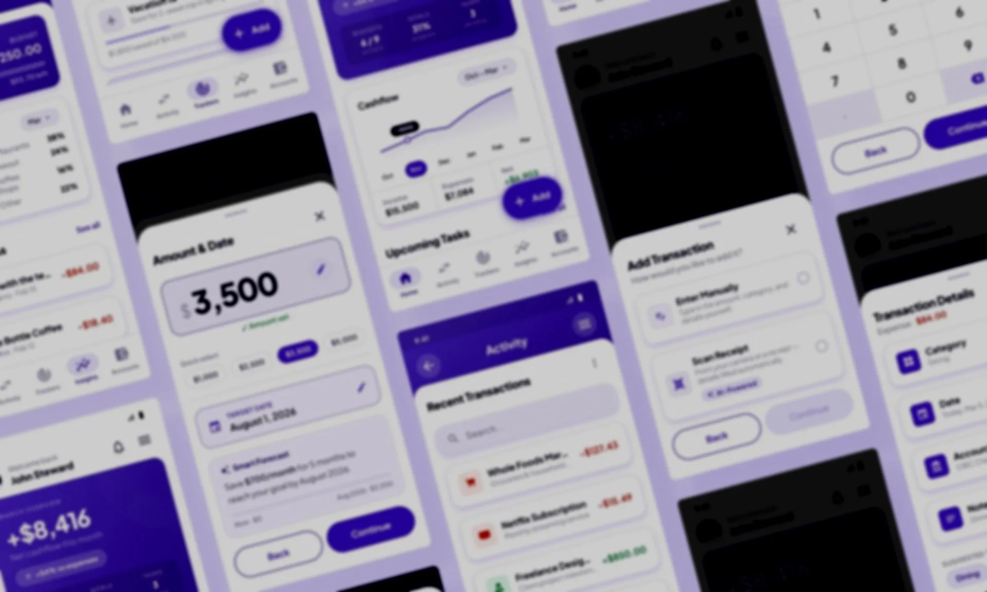
Product Design
MoneyFlow
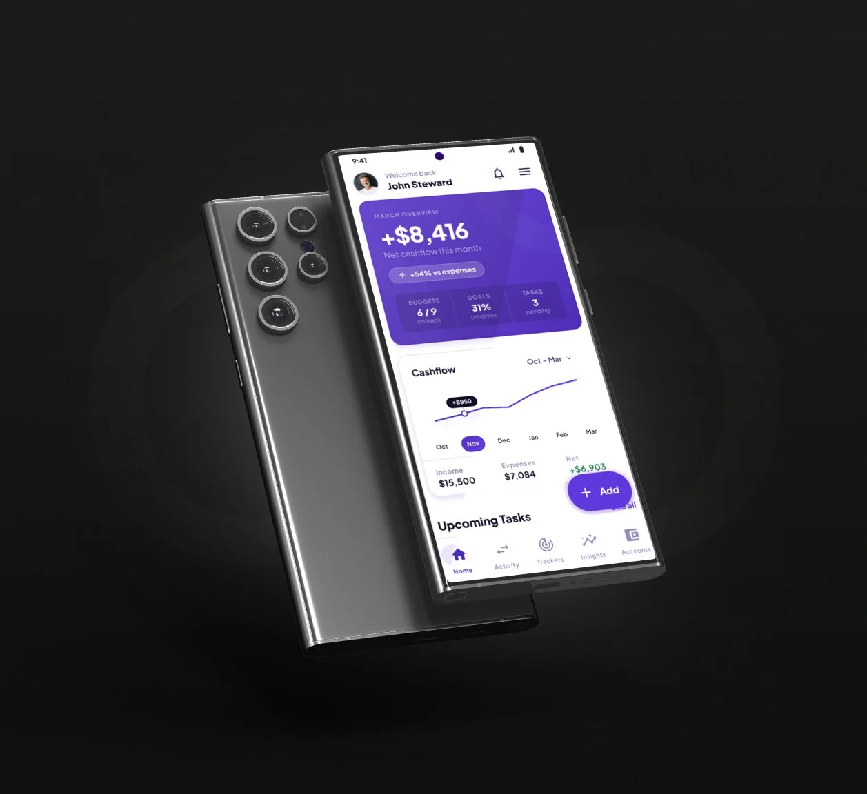
Mobile budgeting app helping users track spending, set goals, and gain financial insights through intuitive data visualization and categorization.
UX Research • Data Visualization • UI Design • Design System
PROJECT OVERVIEW
Design a mobile budgeting app that helps users track spending, set goals, and gain financial insights through intuitive data visualization and categorization.
Role
Product Designer
Timeline
6 weeks
Tools
Figma, Useberry, Google Forms, Claude
• User personas & journey maps
• Wireframes & user flows
• High-fidelity UI design
• Interactive prototype
• Design system components
Deliverables
Quick Navigation
The Challenge
Many people struggle to manage their finances effectively, leading to overspending, missed savings goals, and financial stress. Existing budgeting apps are either too complex for casual users or too simple to provide meaningful insights.
Problem Statement:
How might we create a budgeting app that helps users understand their spending patterns and make better financial decisions without overwhelming them with complexity?
Goals:
Make expense tracking effortless and automatic

Provide clear, actionable insights into spending habits
Help users set and achieve realistic financial goals

Create an intuitive interface that doesn't feel like "work"

UNDERSTANDING THE USER
To understand the real barriers people face when managing money, I conducted three rounds of research: a survey, user interviews, and a competitive analysis of existing finance apps.
-
Five participants aged 25–40 were recruited via Prolific and screened as active budget planners.
-
Five products were audited; Mint, YNAB, and PocketGuard as direct competitors, and Revolut and Notion Templates as indirect alternatives.
-
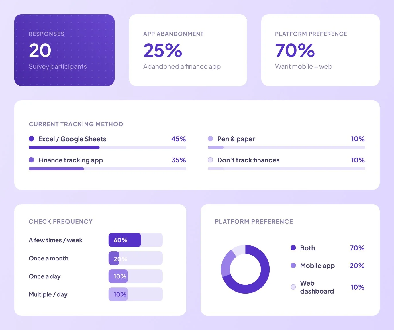
An open survey was distributed to 20 respondents to gather quantitative data on current tracking behaviours and pain points.
Research Methods:
The research phase combined qualitative and quantitative methods to identify both the emotional and behavioural patterns behind poor financial habits — and where existing tools were falling short.
Key Findings:

Manual Entry is a Barrier
73% of respondents said they stopped using budgeting apps because manual entry was too time-consuming.

Complex Categories Confuse Users
Users want simple, intuitive categories, not 30+ pre-set options

Insights Over Data
People don't want raw data—they want to know "Am I doing okay?" and "Where can I improve?"
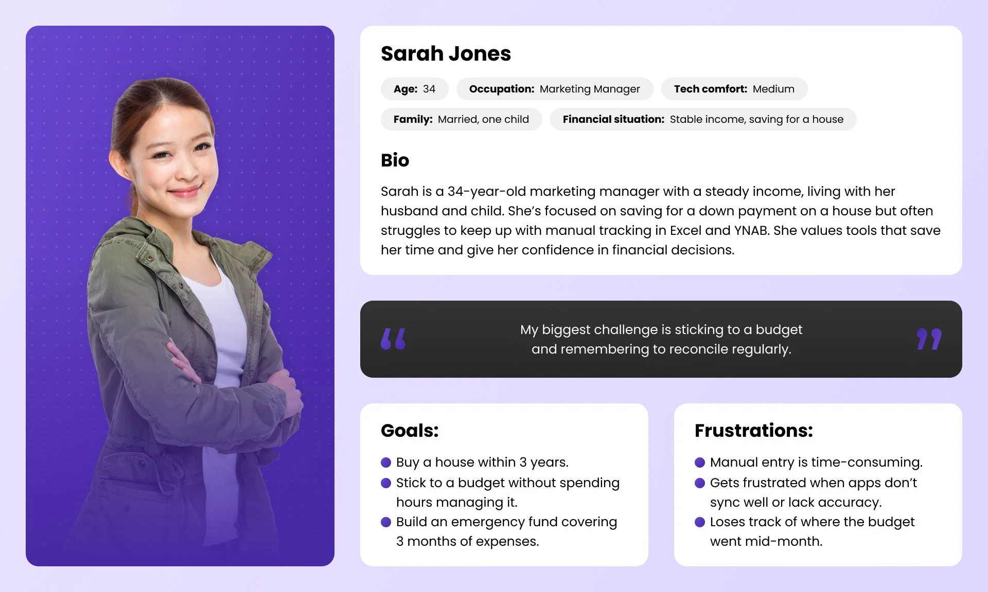
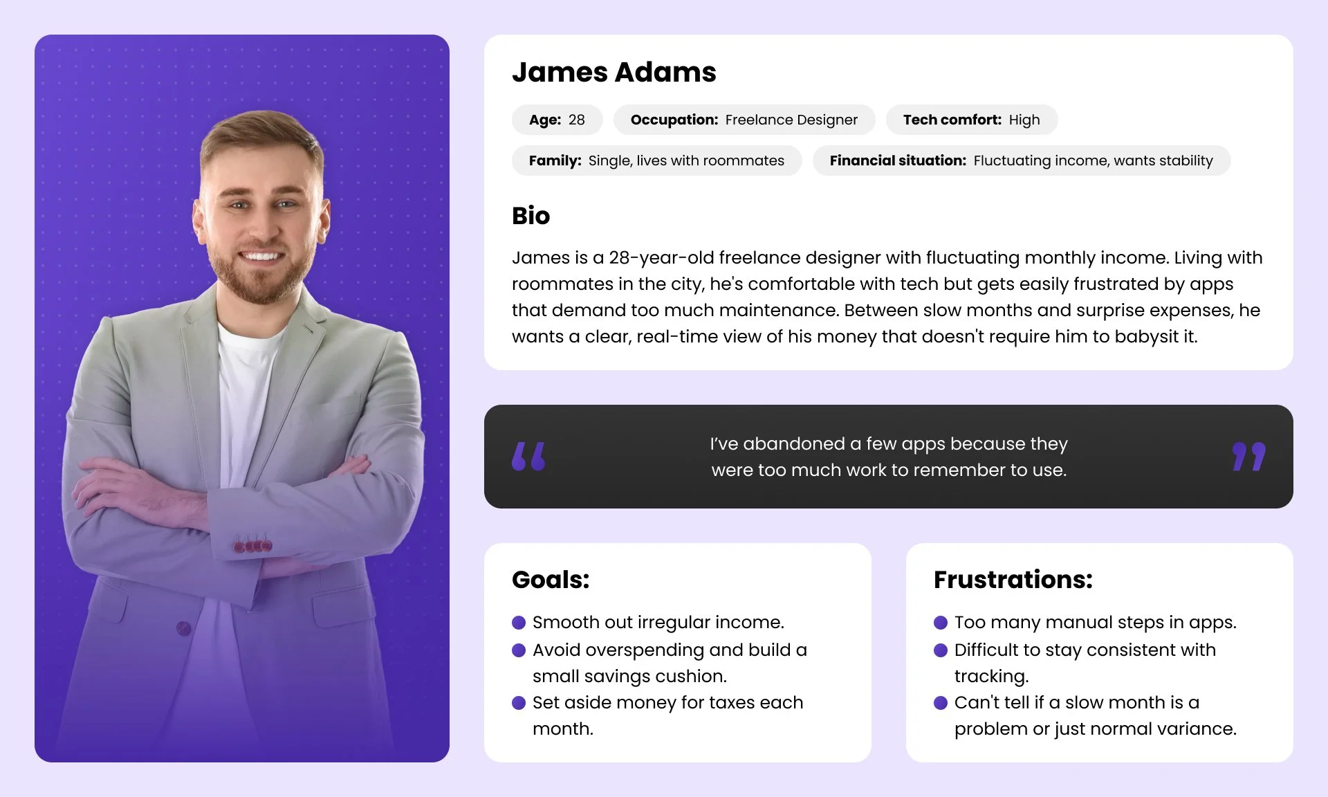
User Personas
DEFINING THE SOLUTION
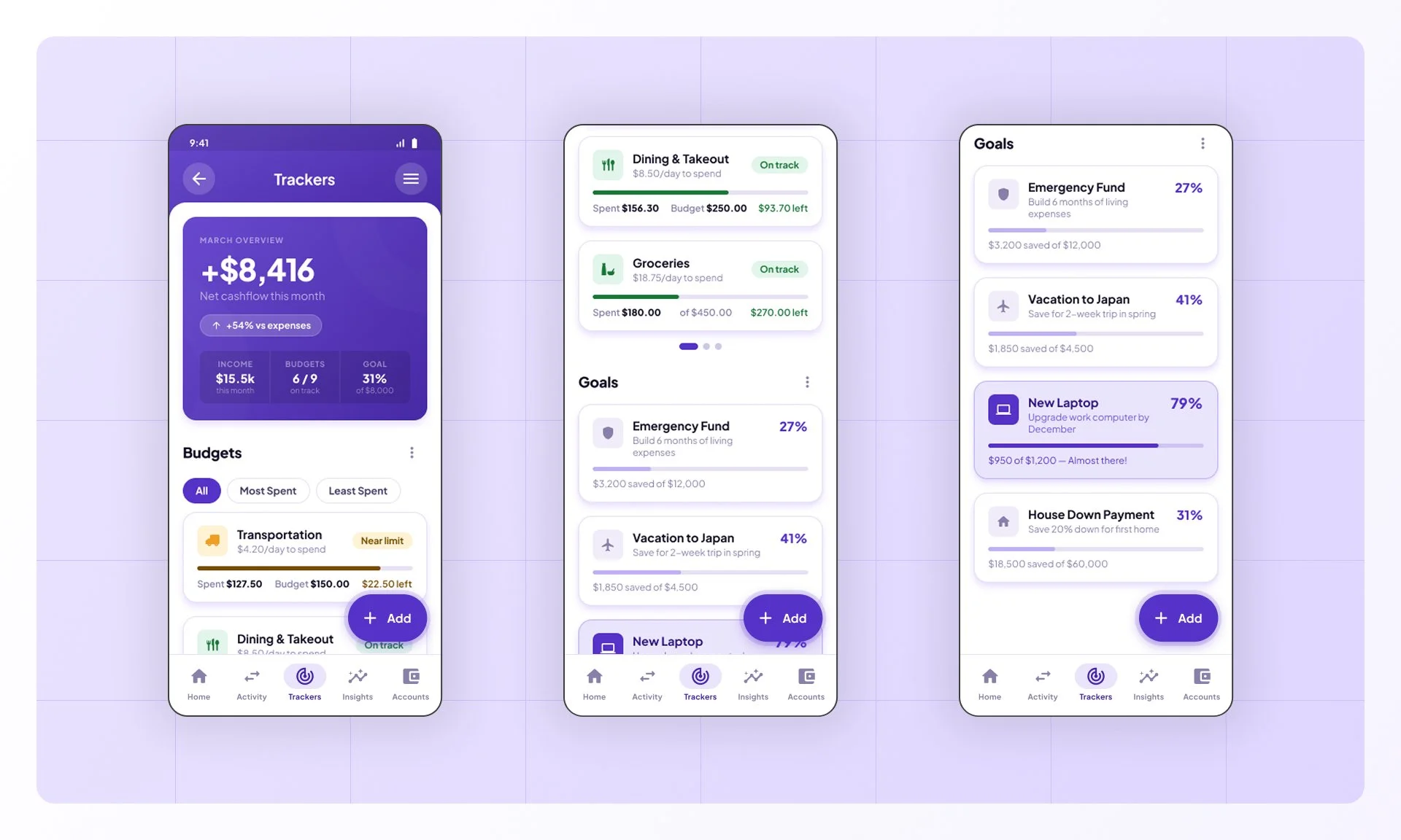
Based on research findings, I identified three core features that would address user needs:

01. Smart Automatic Tracking
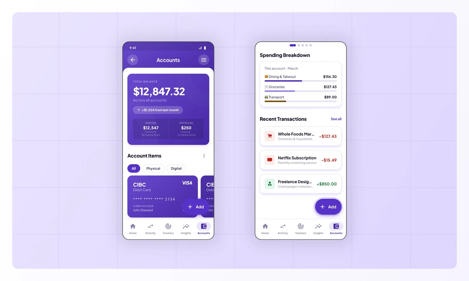
Reduce manual entry by connecting bank accounts, AI receipt scanning, and using AI to categorize transactions.

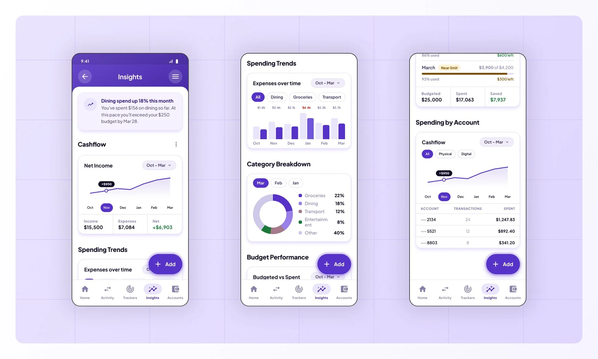
02. Visual Spending Insights
Transform data into clear, actionable visualizations that show spending patterns at a glance

03. Goal-Based Budgeting
Let users set goals (save for vacation, pay off debt) and track progress with motivation
User Flows:
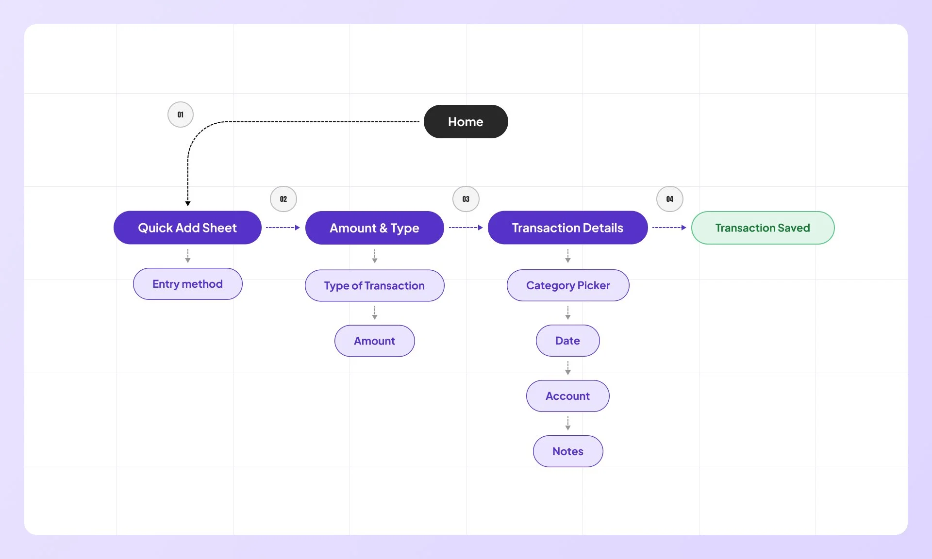
Add Transaction
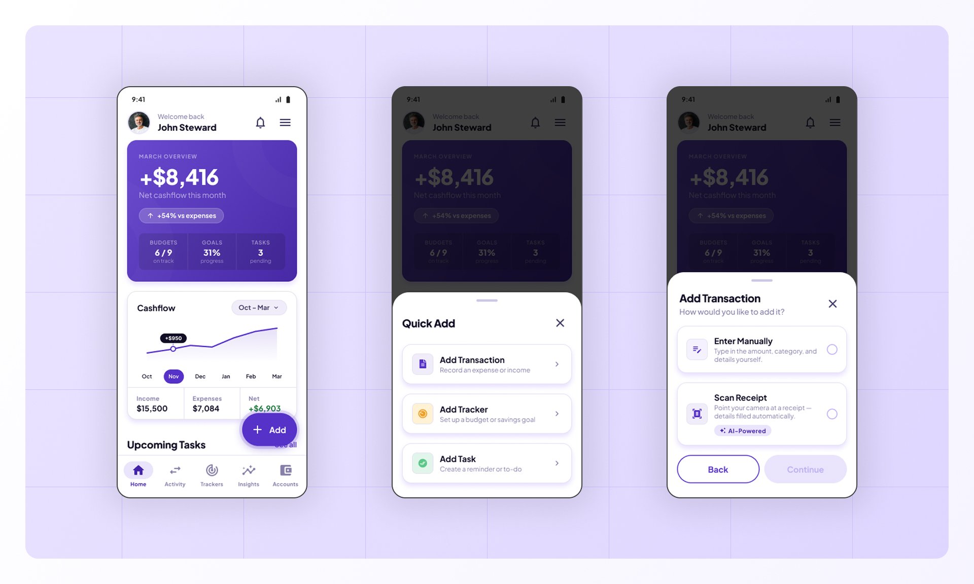
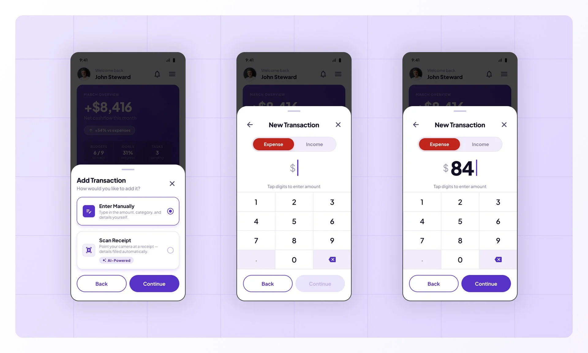
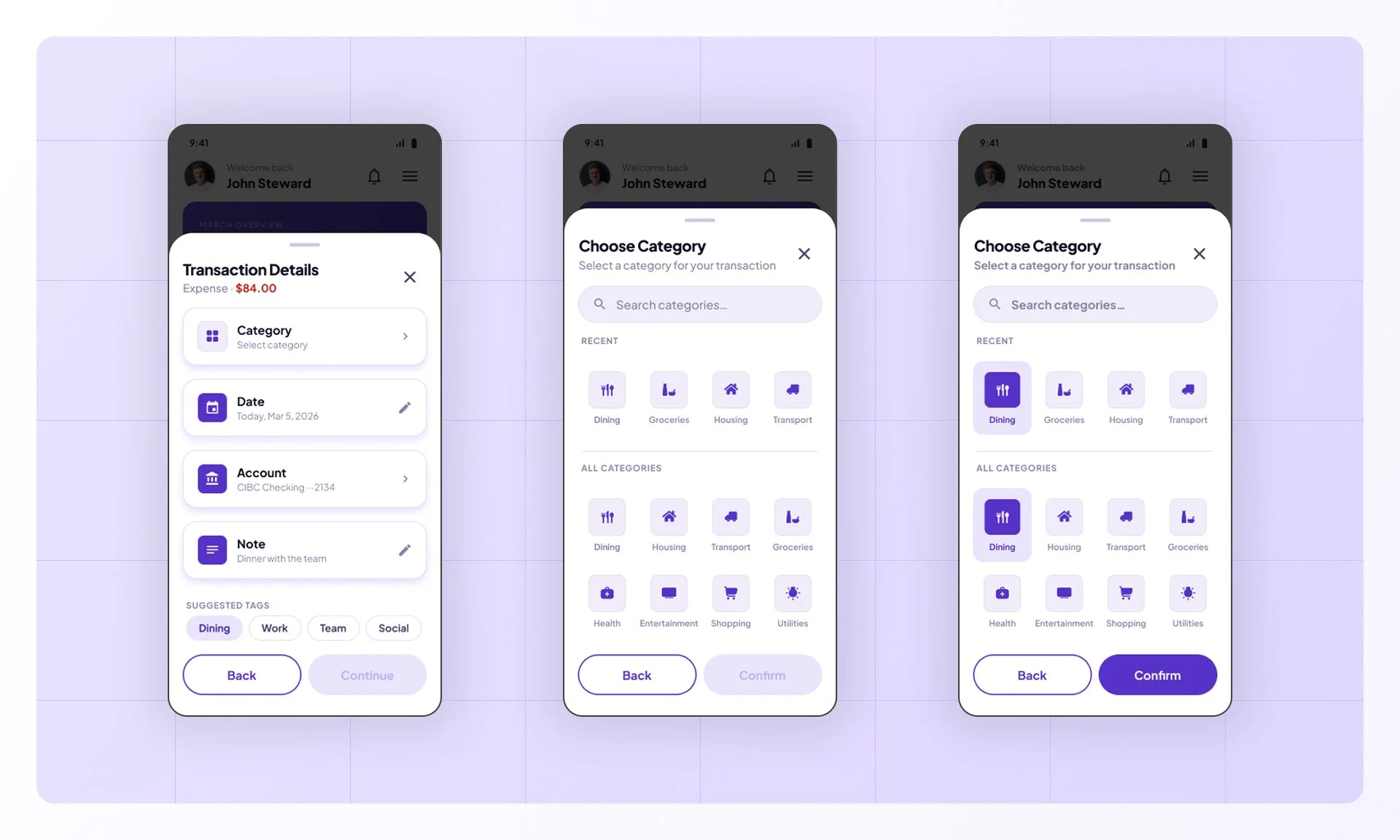
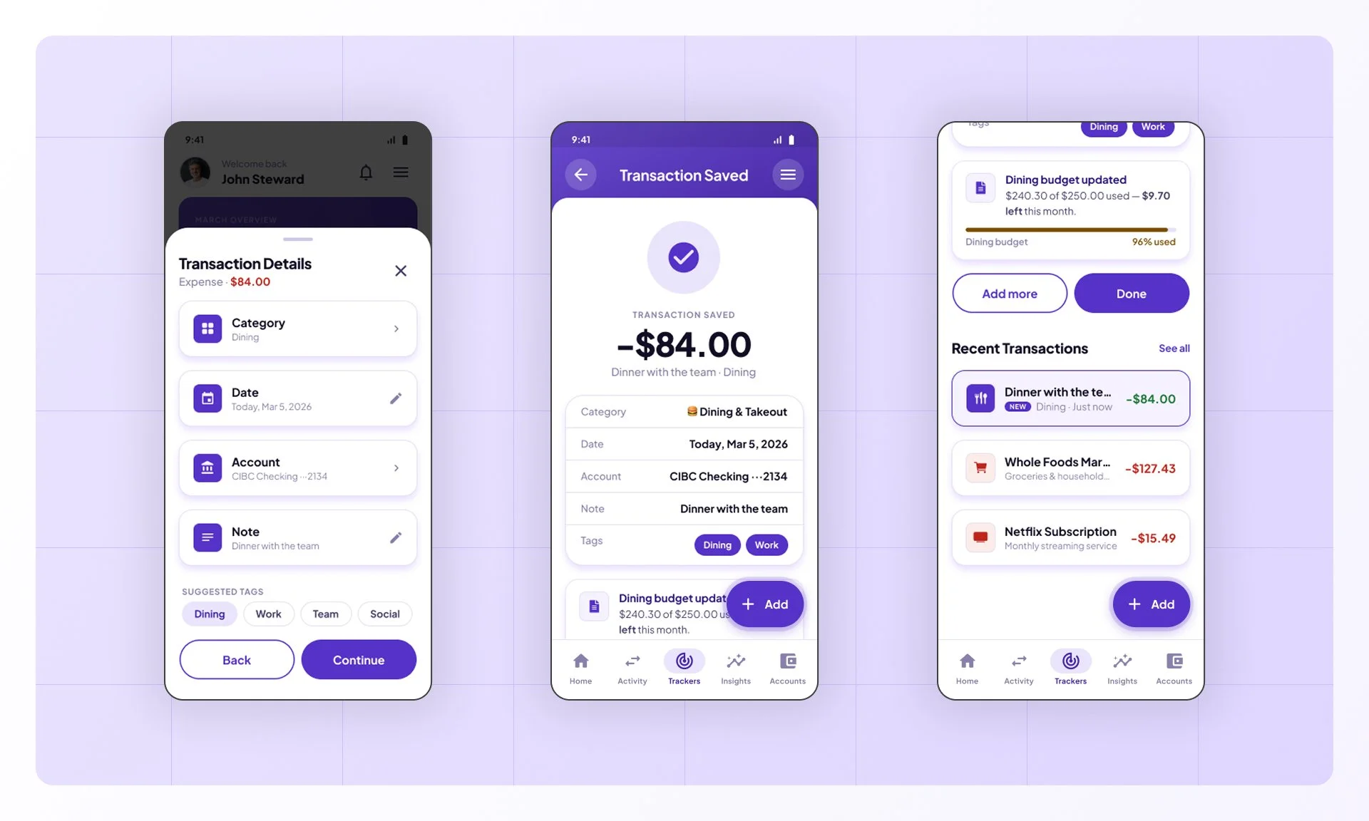
Users can log an expense in seconds from the home screen. Tapping the FAB opens a quick-add sheet where they pick an entry method, enter an amount, and fill in the details (category, date, and account) before the transaction is saved.
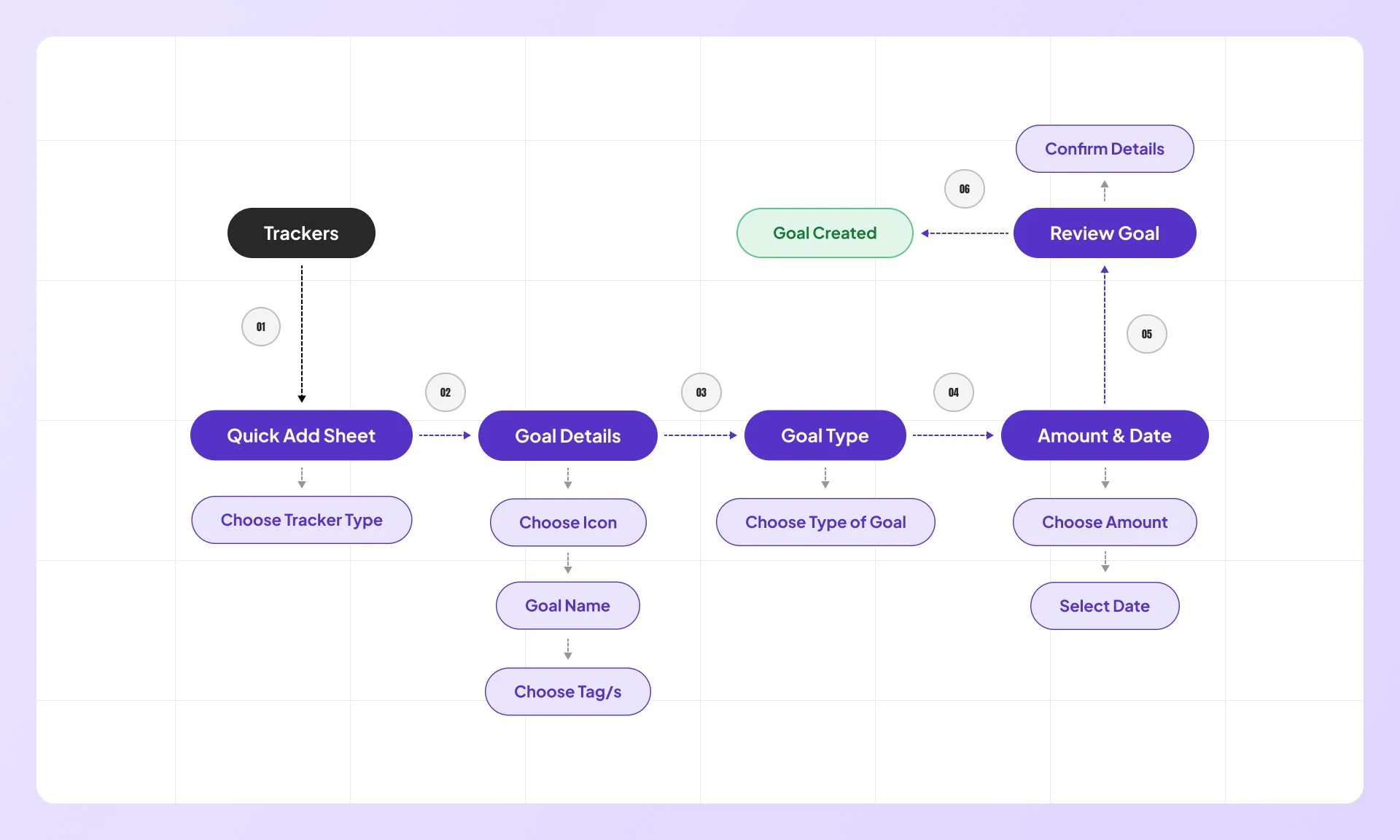
Set A Goal
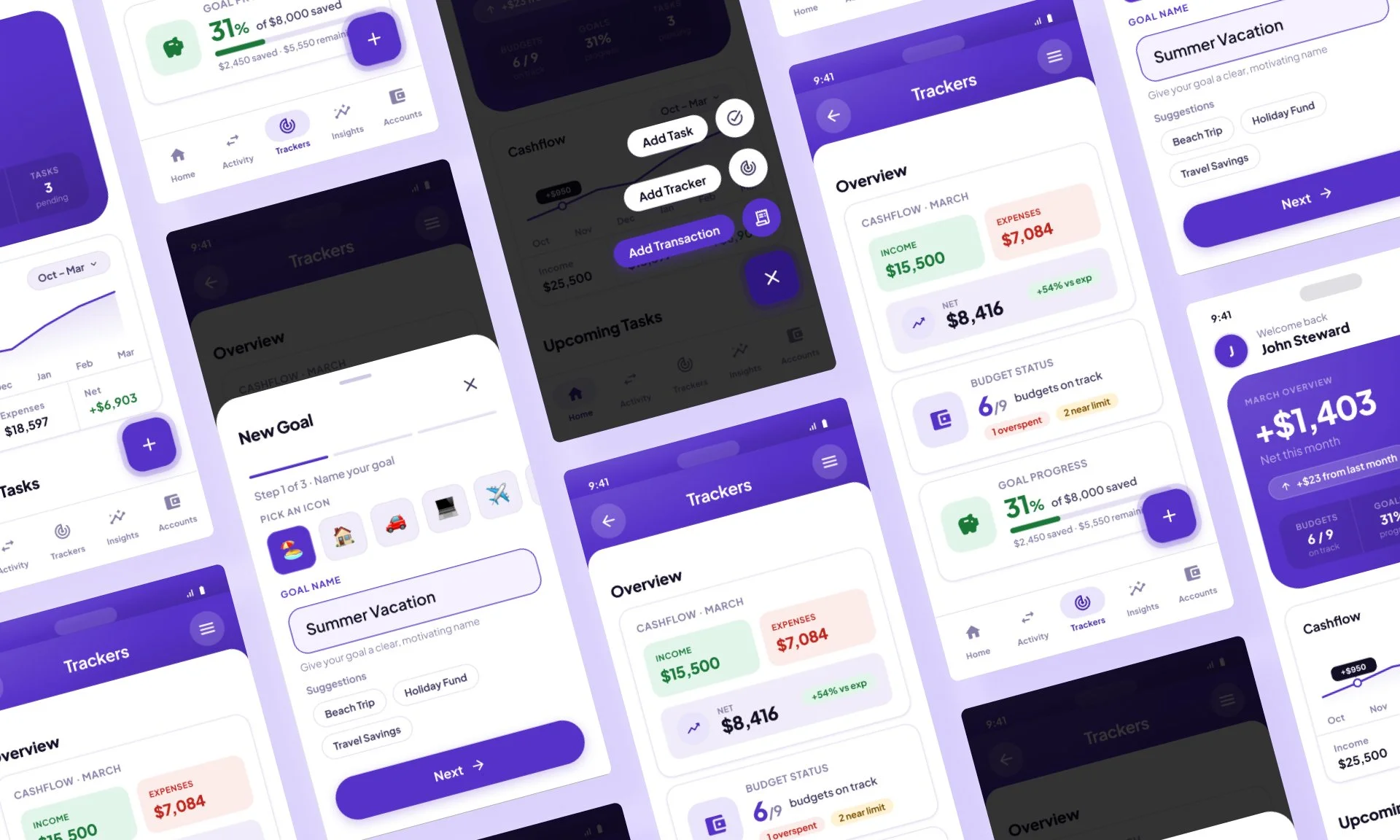
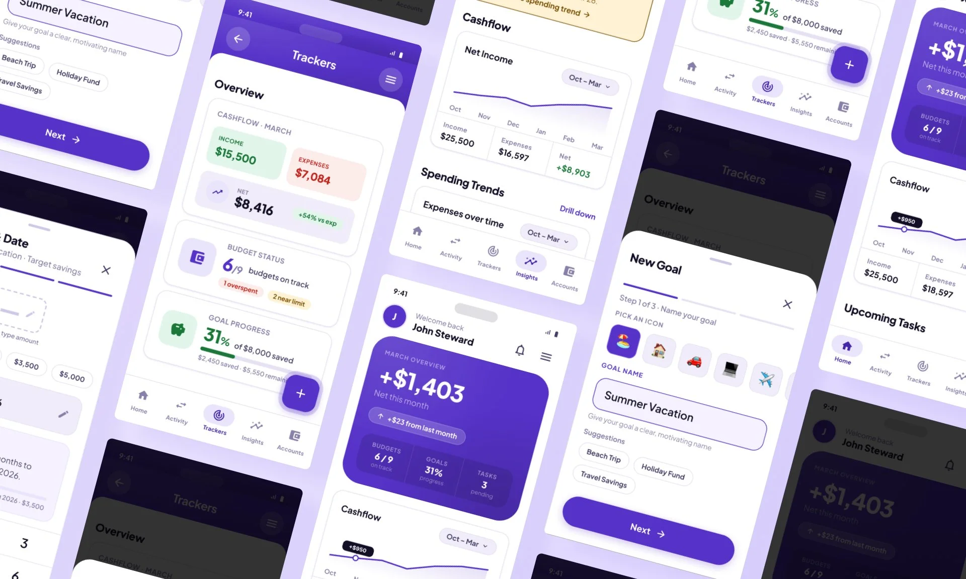
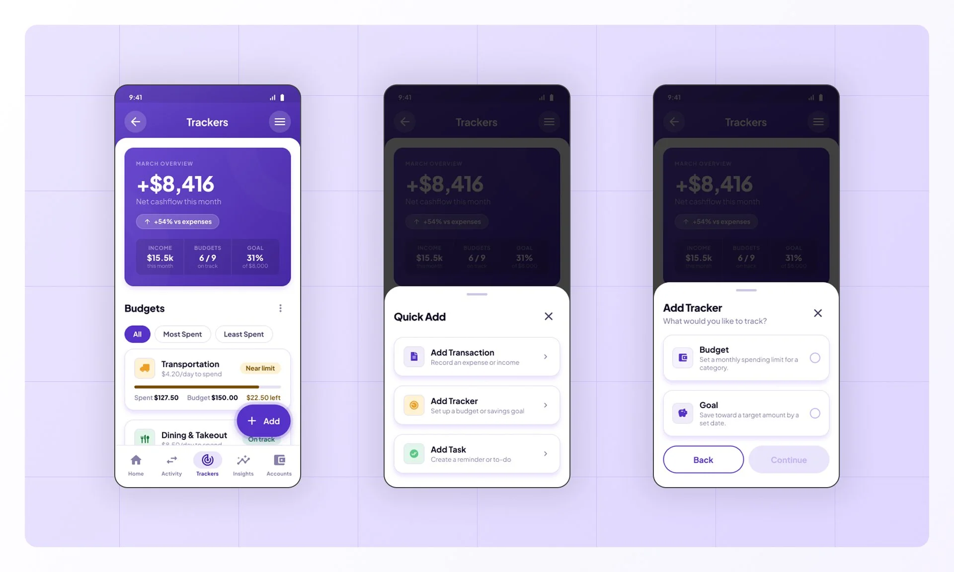
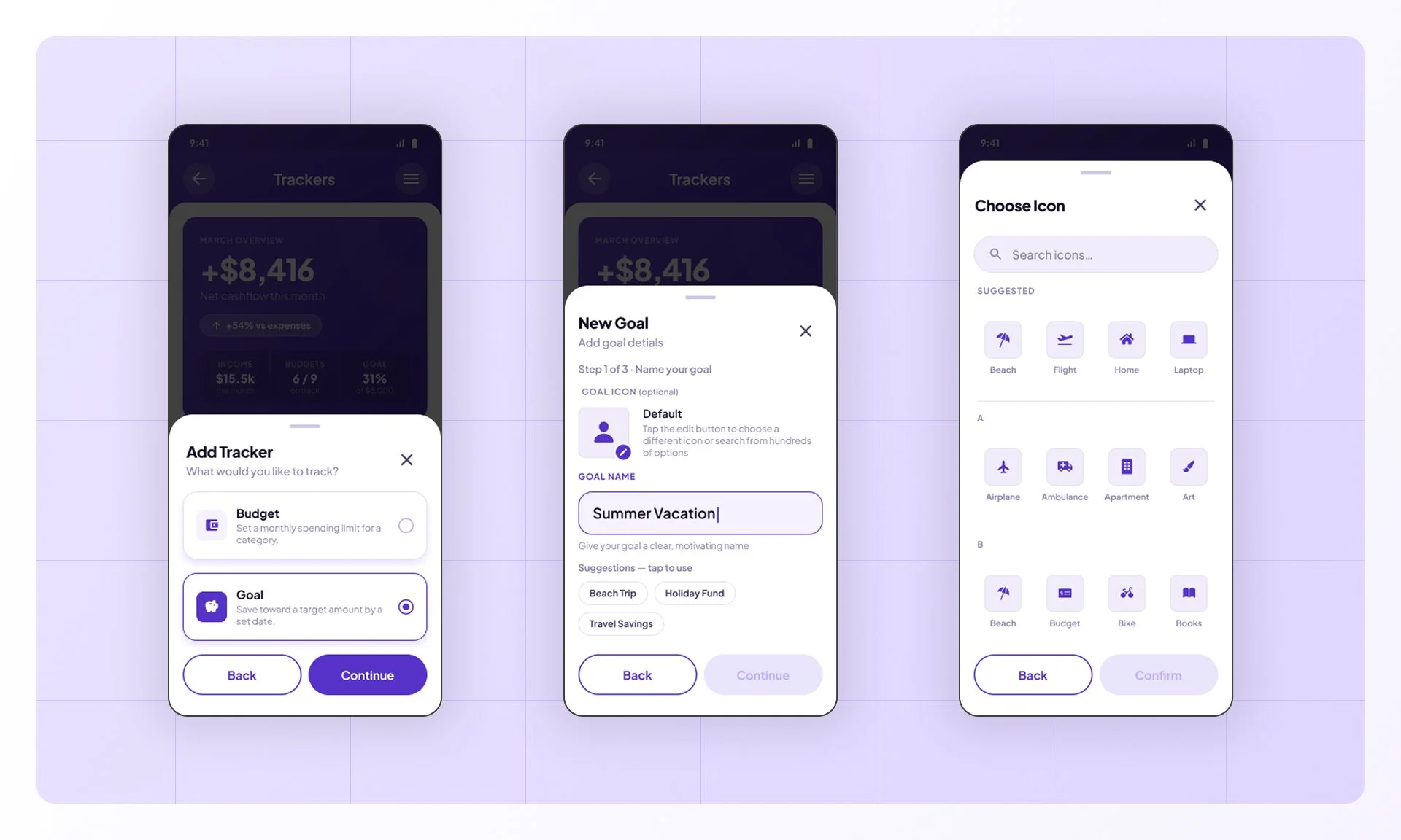
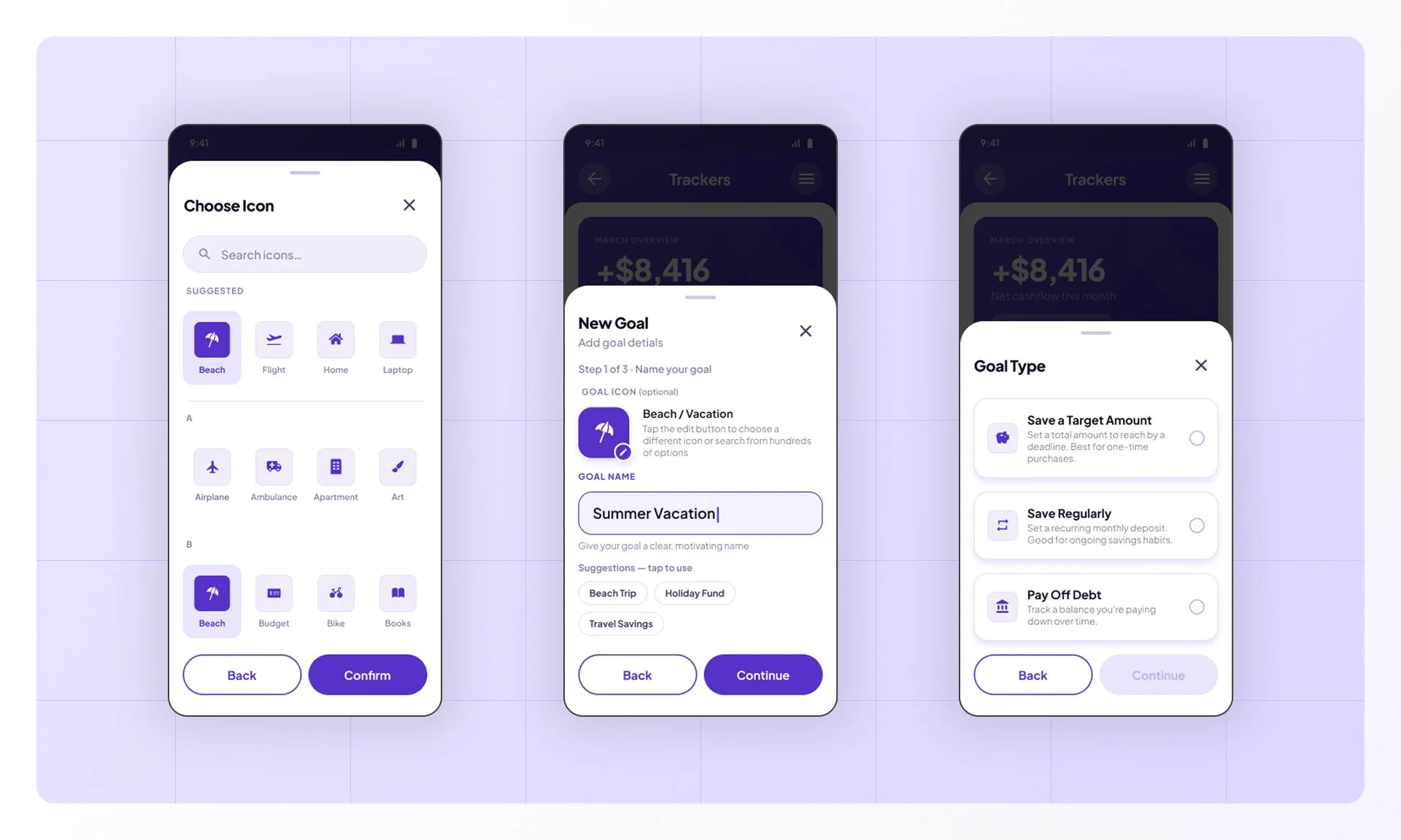
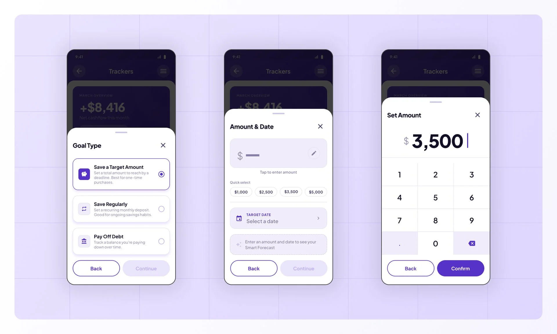
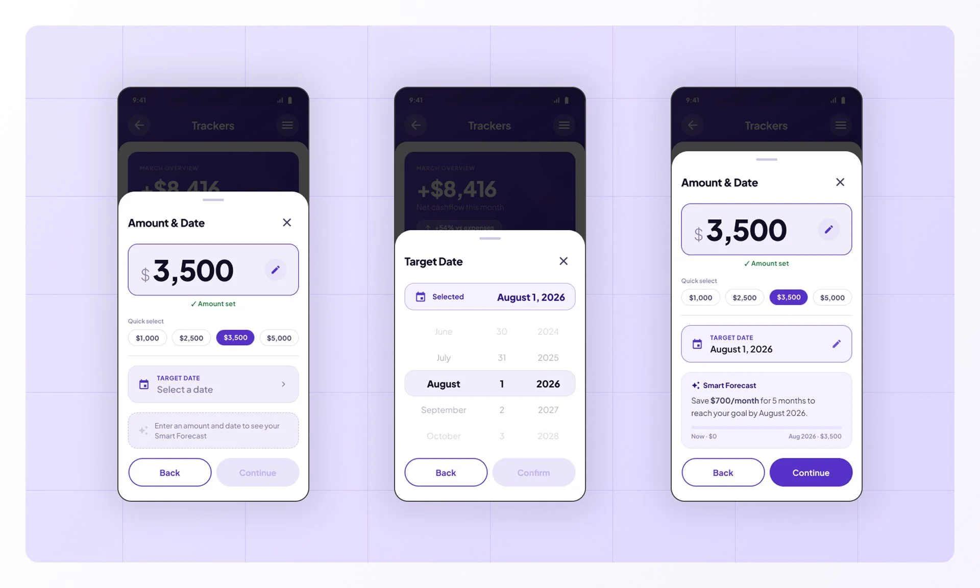
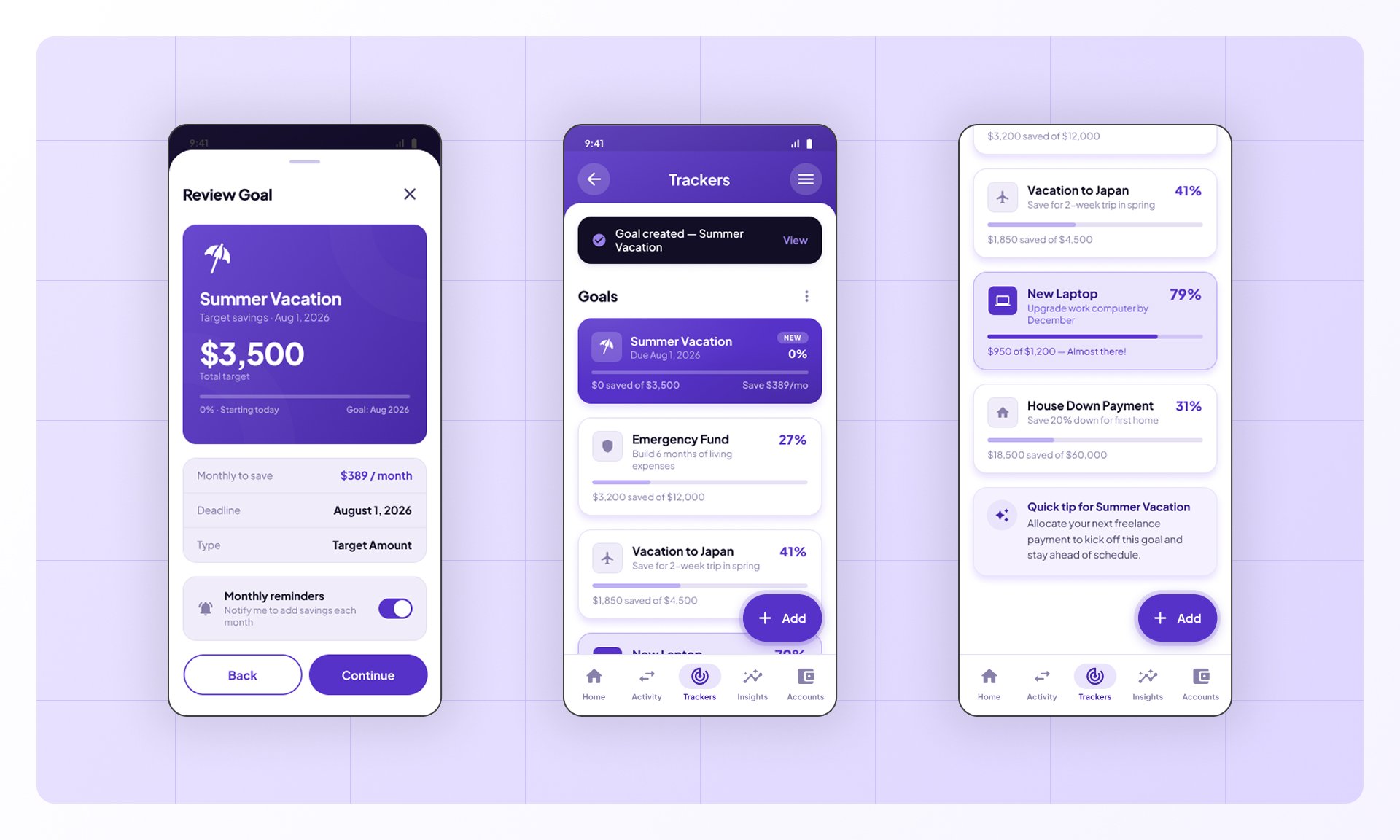
From the Trackers screen, users open the quick-add sheet, name their goal, pick an icon and type, then set a target amount and deadline. A smart forecast previews their progress before they confirm and create the goal.
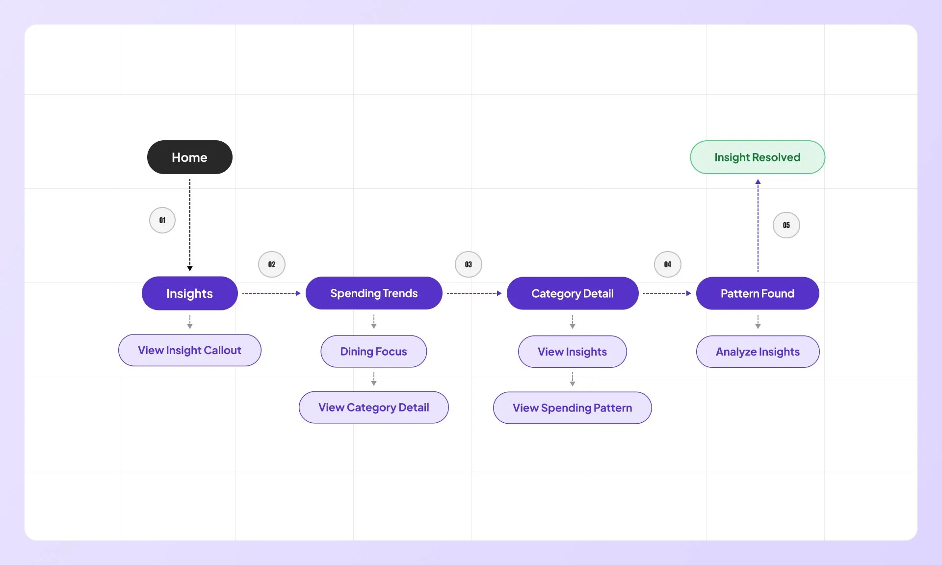
View Insights
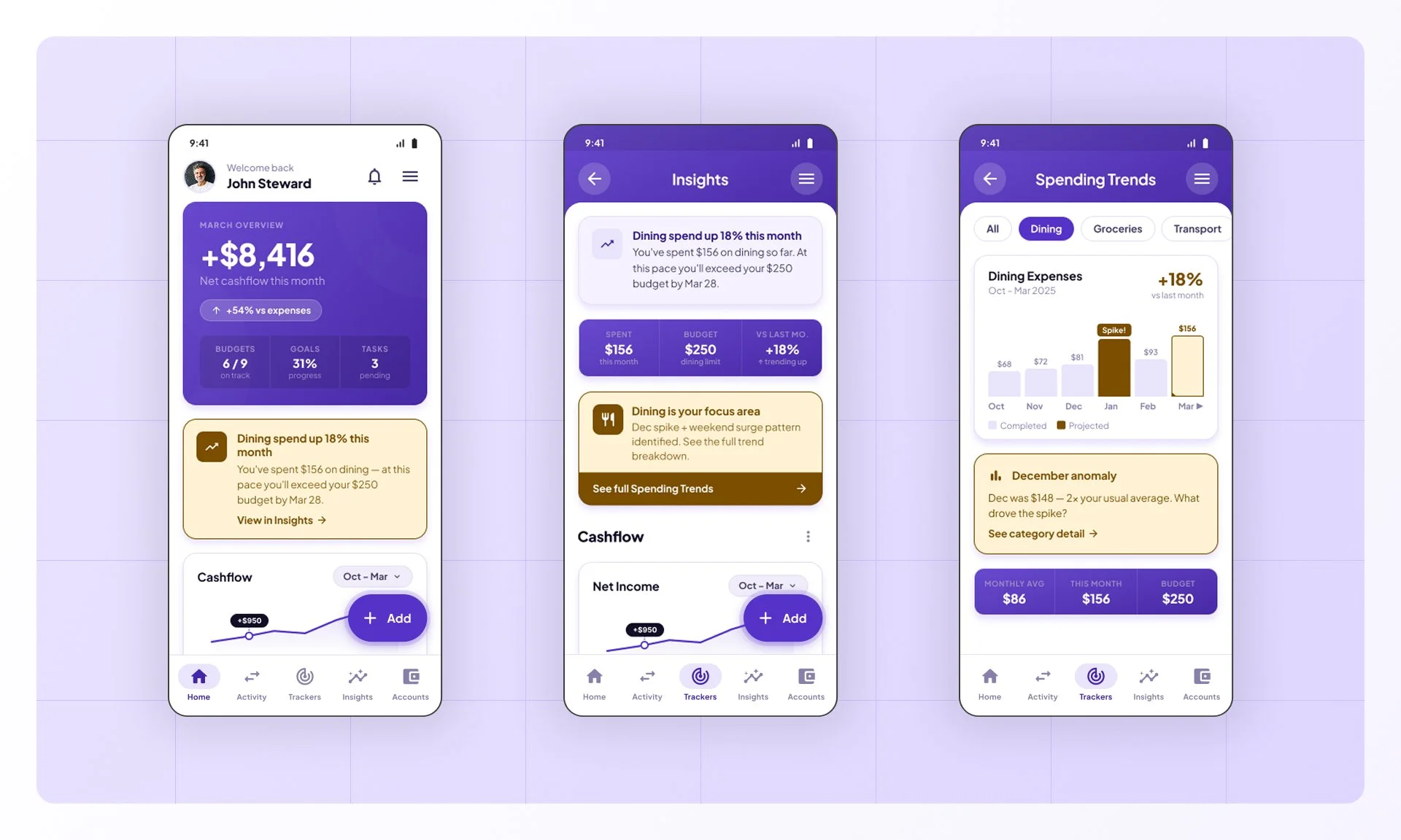
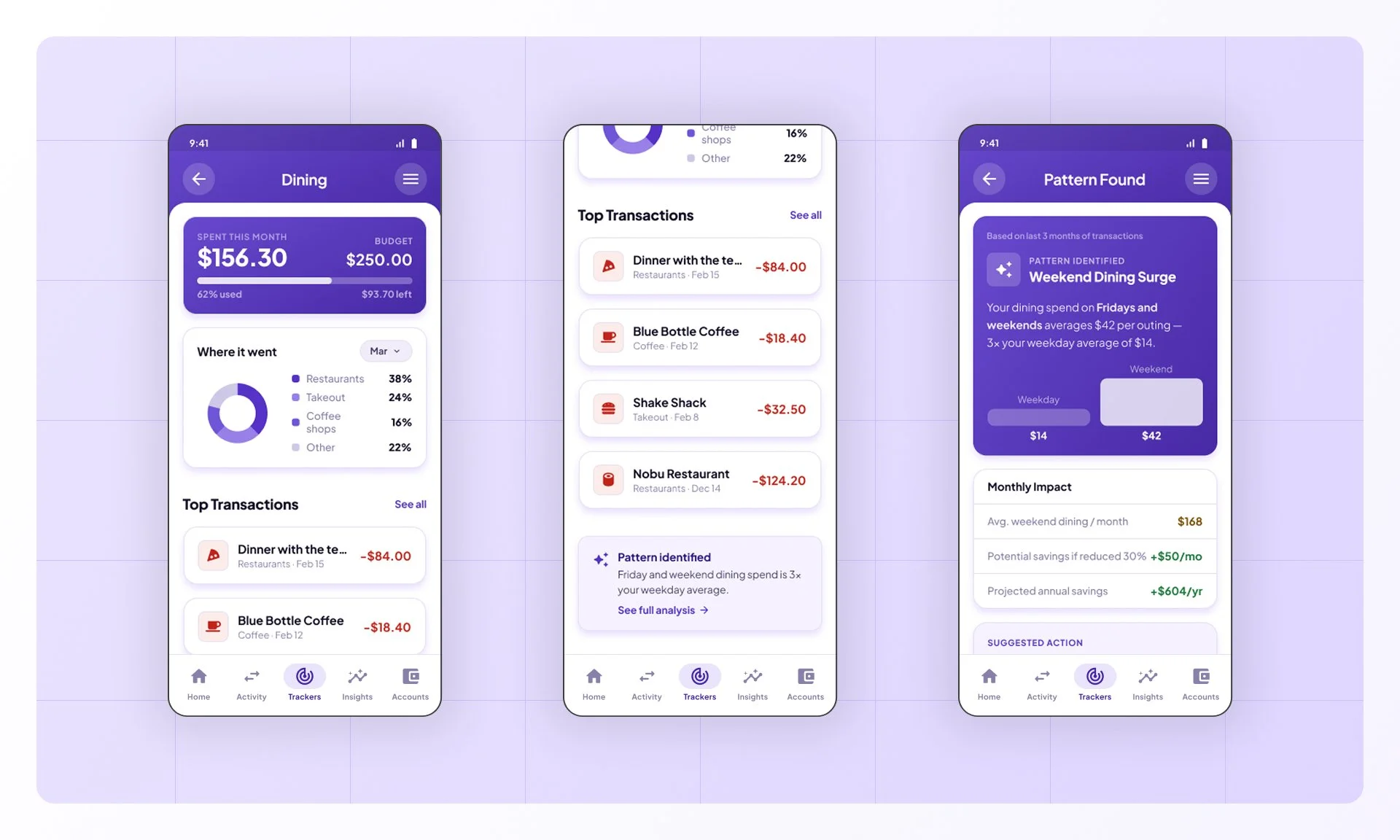
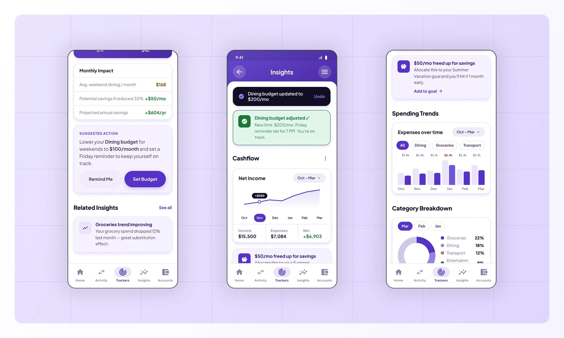
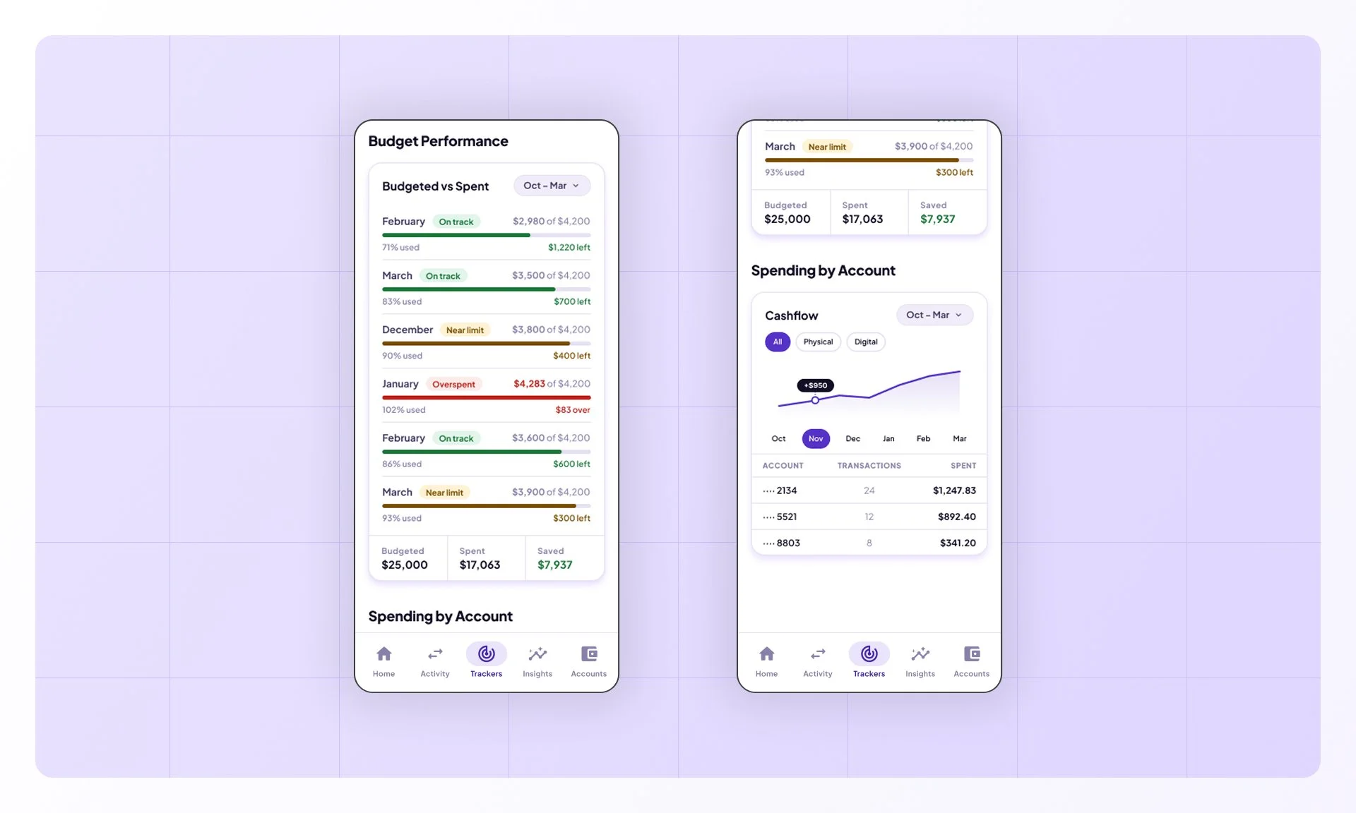
When MoneyFlow detects a notable pattern, it surfaces a callout on the home screen. Users tap through to Insights, drill into a spending trend and category, and explore the pattern in detail — giving them a clearer picture of where their money is going.
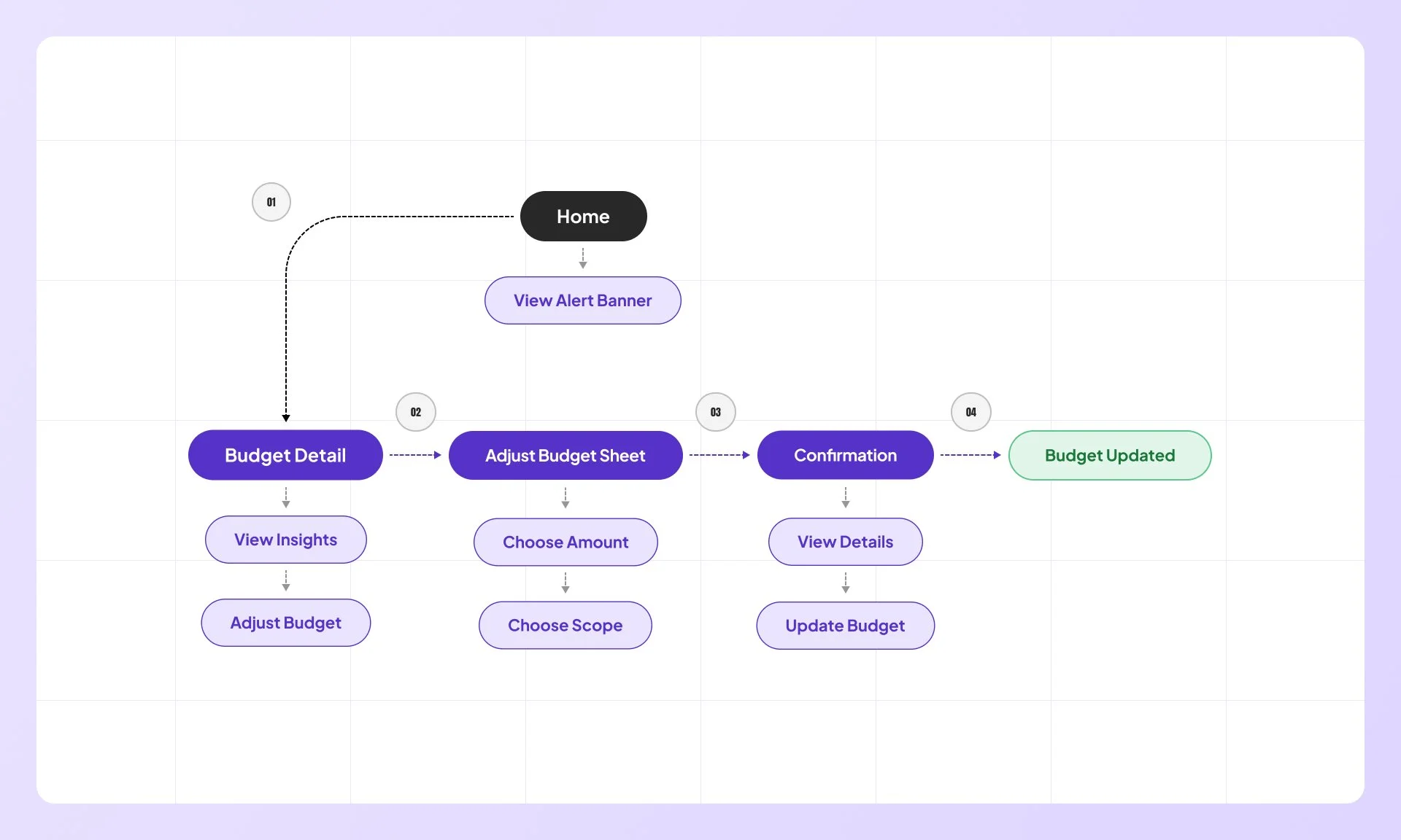
Update budget
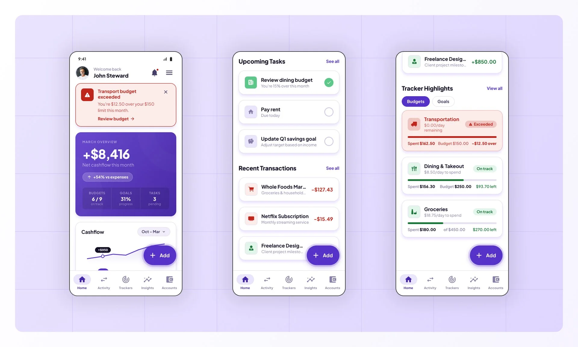
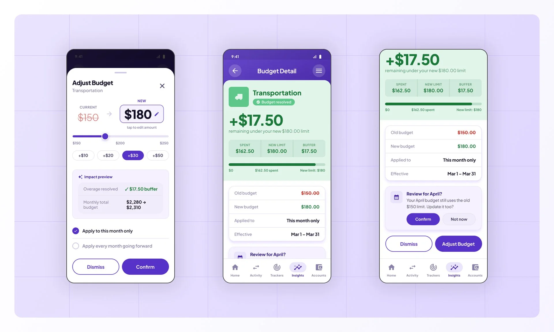
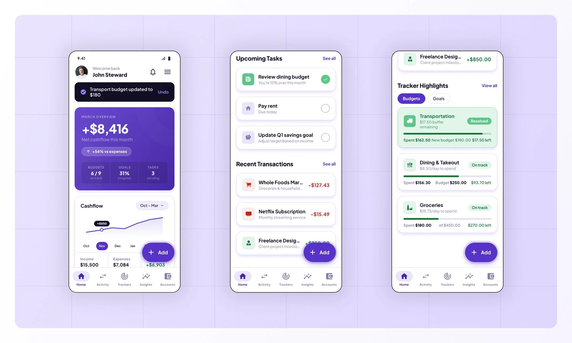
When a budget is exceeded, MoneyFlow alerts the user with a home screen banner. From there they can review the detail, open the adjustment sheet to set a new limit and scope, confirm the change, and return to a resolved home screen with Trackers updated.
Exploring Ideas
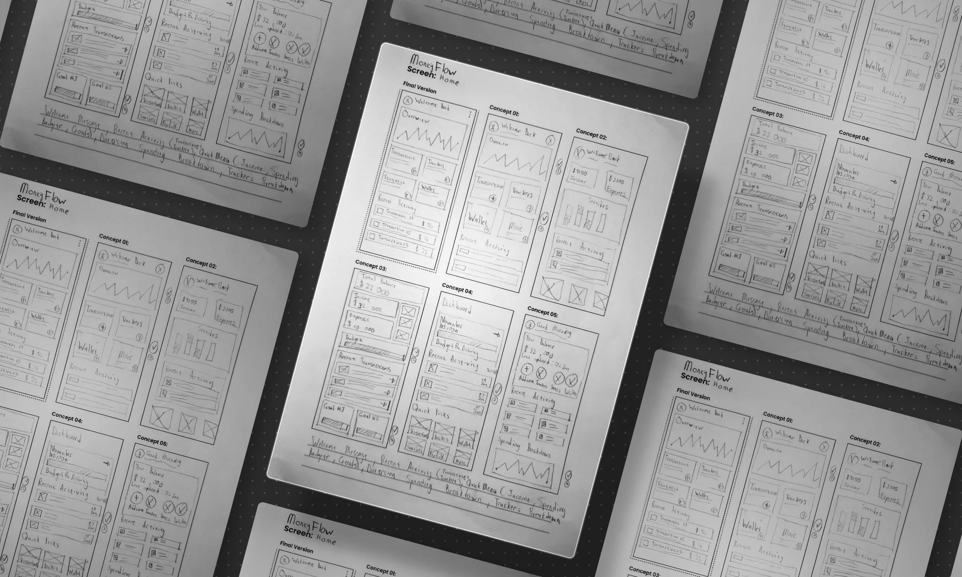
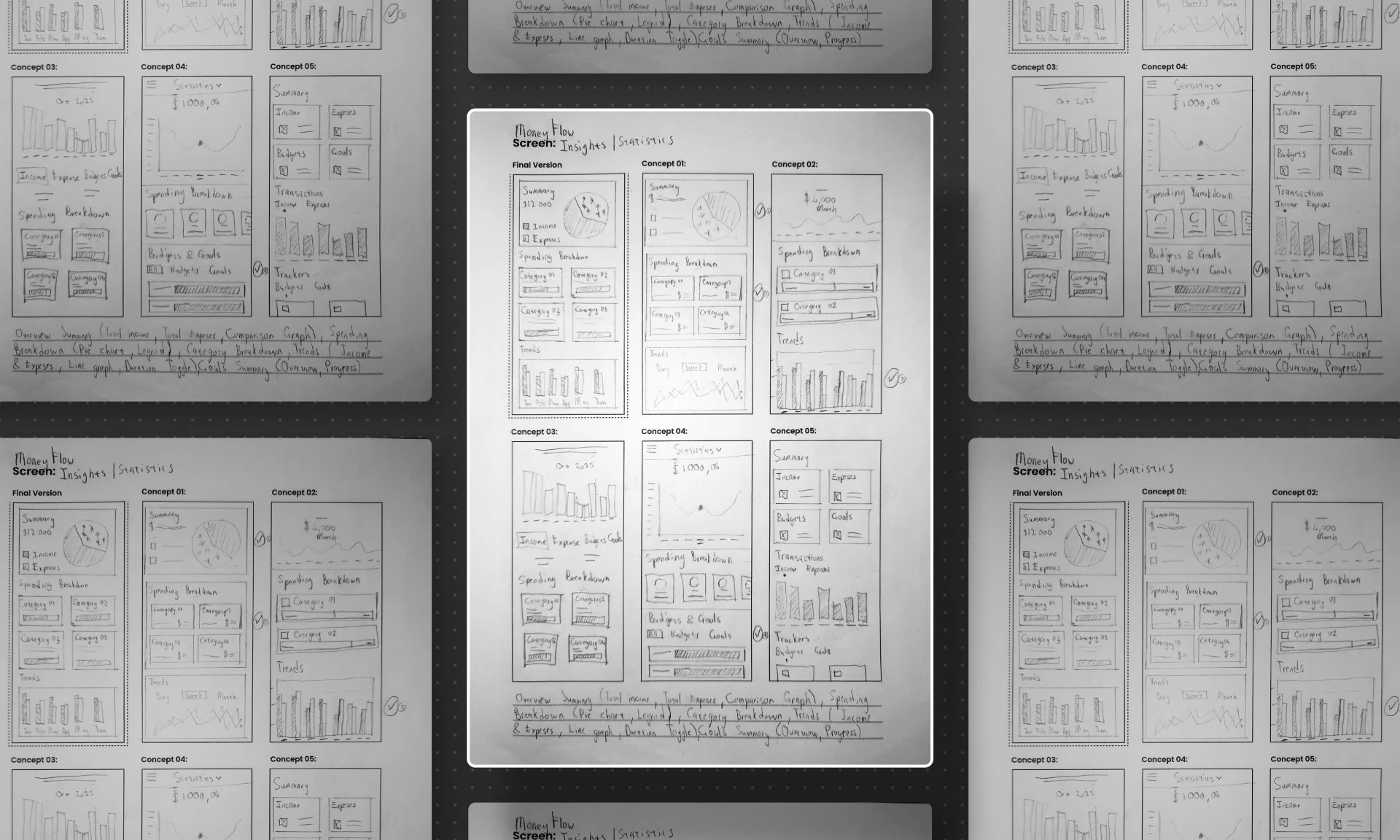
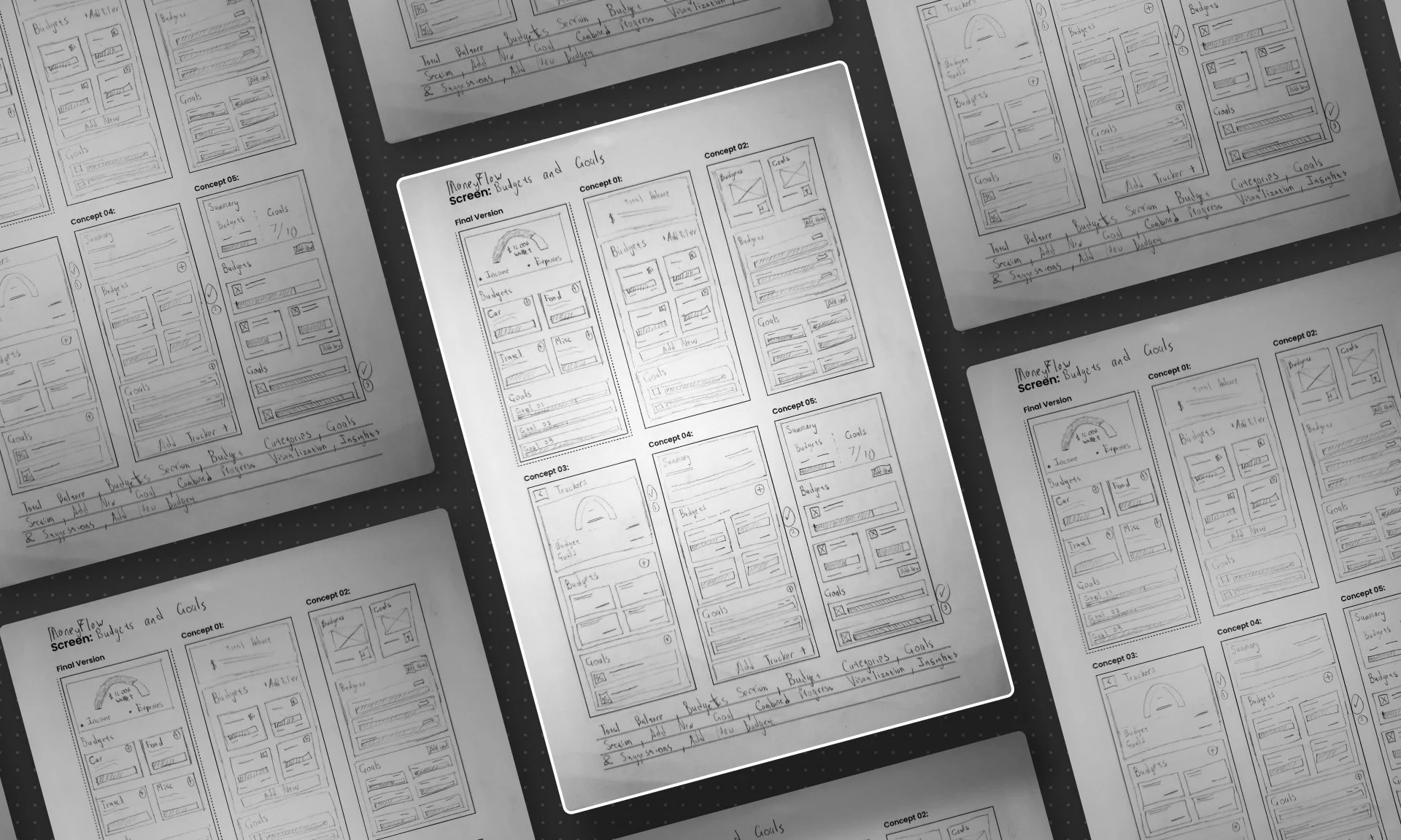
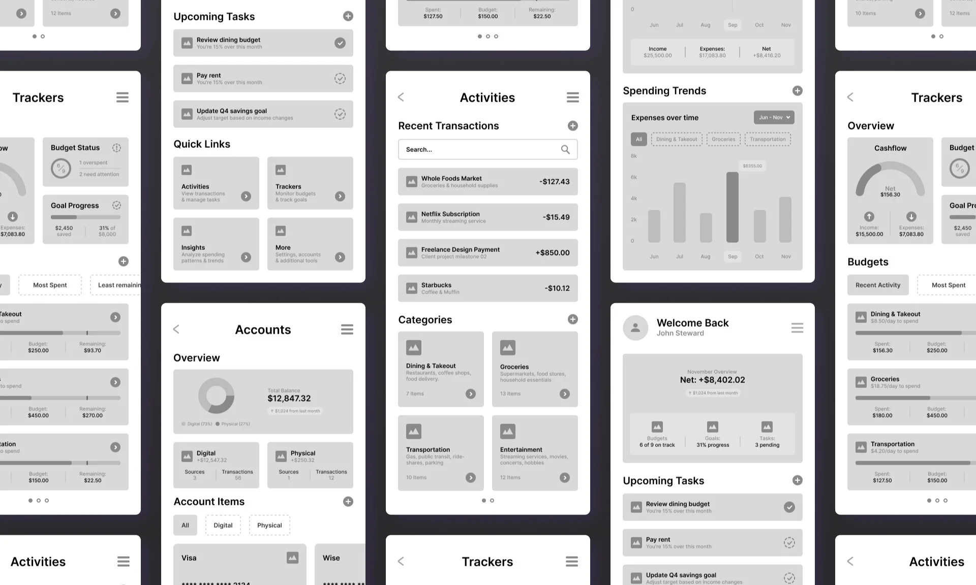
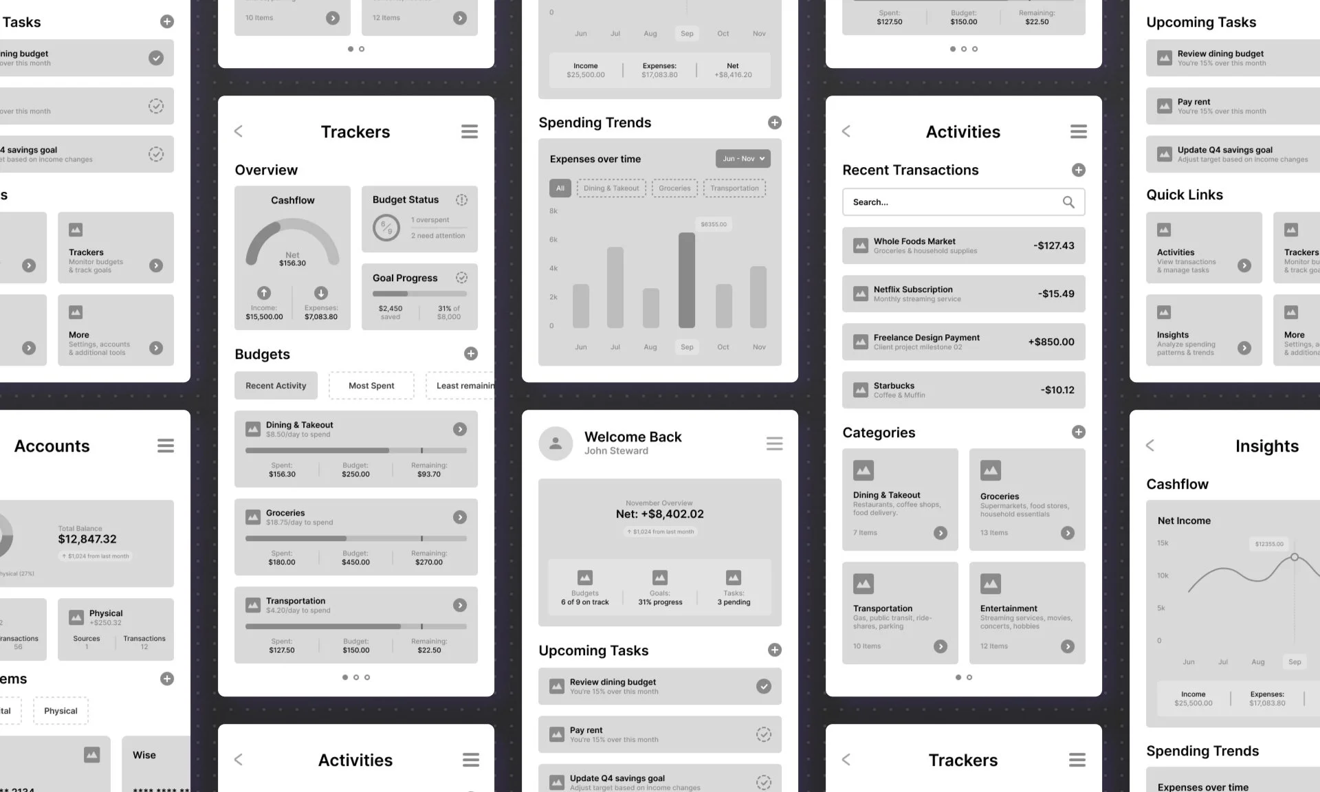
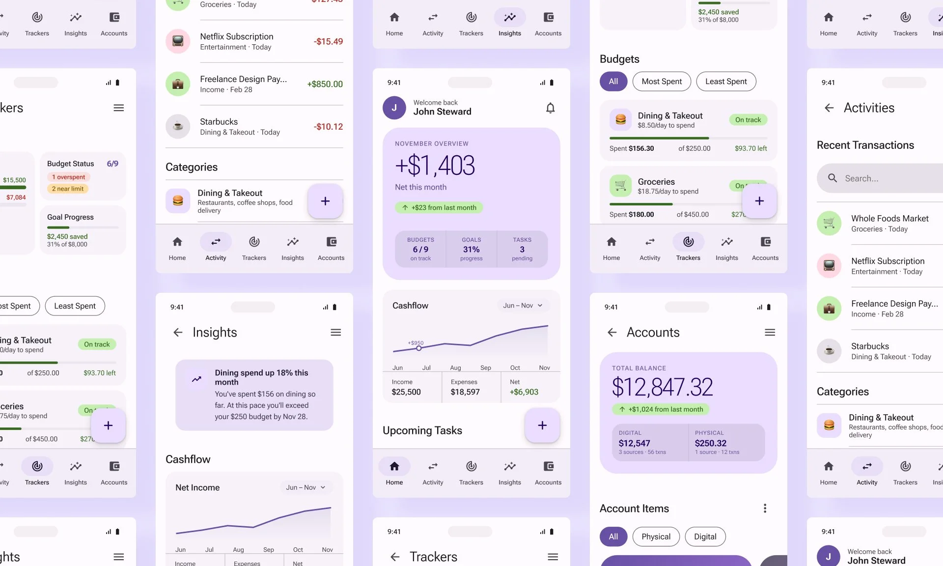
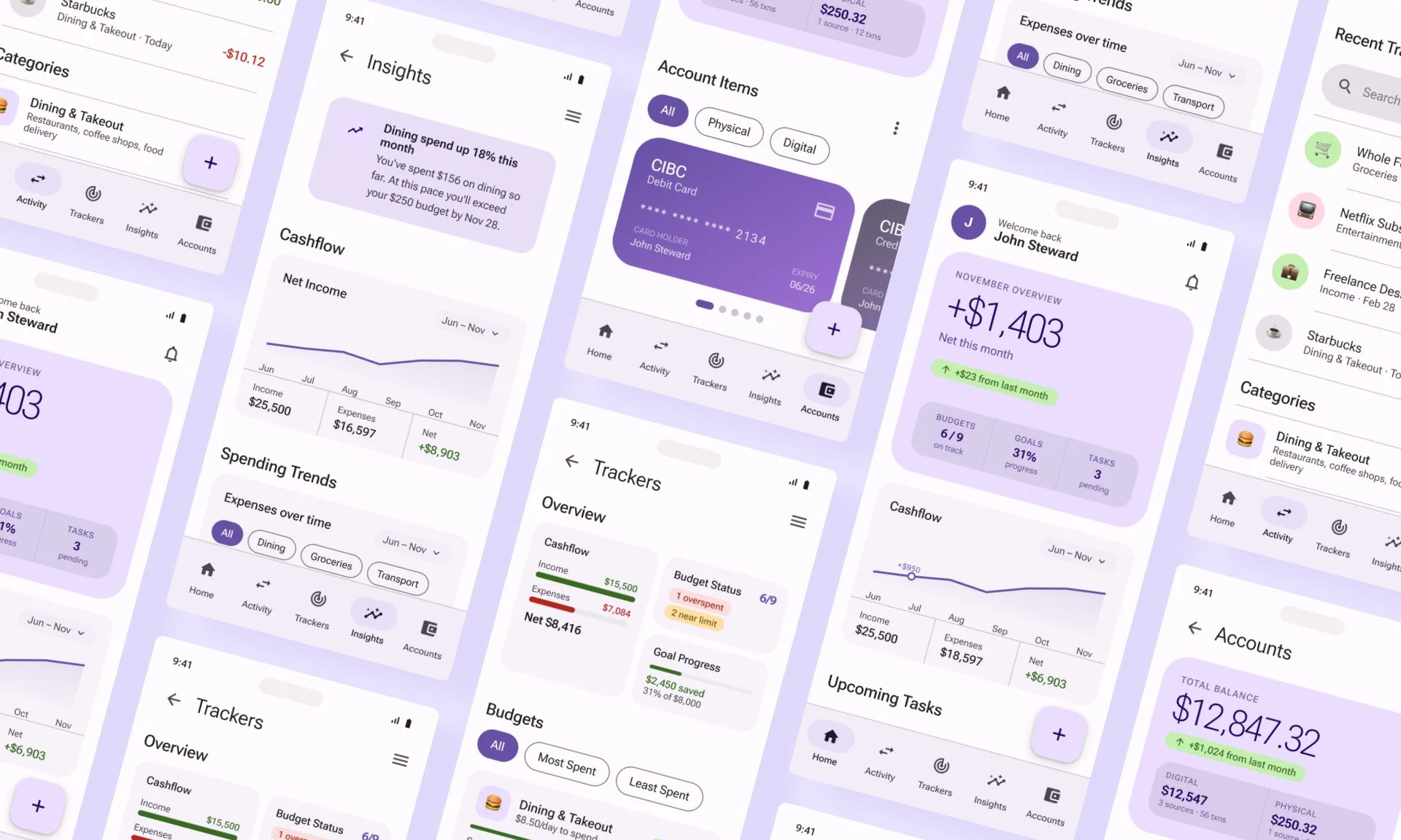
Before touching Figma, I sketched multiple layout directions across all core screens, exploring how to structure the home dashboard, the transaction flow, the tracker overview, and the insights view. Lo-fi wireframes followed to pressure-test information hierarchy and flow logic before committing to high-fidelity design.
Testing with Users
This usability study was an unmoderated remote study run on Useberry with participants recruited via Prolific. Five Budget Planner participants completed four goal-oriented task flows.
-
Before the prototype tasks, participants completed a short intro survey to establish context. Questions covered how frequently they tracked their finances, which tools or methods they currently used, whether they actively tracked savings goals, and how they typically responded when they overspent in a category.
-
Participants completed four task flows in sequence, each starting from a specified screen with no guided instructions:
Flow 01 — Add a Transaction:
Flow 02 — Set a Savings Goal
Flow 03 — View a Spending Insight:
Flow 04 — Respond to a Budget Alert
-
After completing all four flows, participants answered three open-ended questions. Participants also completed a 10-item SUS questionnaire, producing an overall score of 67.5; with an adjusted mean of 78.75 when the single outlier session is excluded.
Key Findings:

What Worked:
• Flow 03 (View Insights) achieved 100% task completion with a perfect click-to-map ratio, no wasted taps.
• Flow 04 (Budget Recovery) completed with 100% success and the tightest time distribution across all flows.
• Participants consistently described the home screen layout as easy to read and navigate at a glance.
• The spending trend drill-down in Flow 03 required zero backtracking — every participant moved forward through the screens in sequence without hesitation.
• The step-by-step structure of the transaction confirmation in Flow 01 was completed quickly and consistently, suggesting the information hierarchy between amount, category, and details felt natural to users.

What Needed Improvement:
• The FAB was a plain round icon button with no label, giving users no indication of what it would do — several participants paused before tapping it (redesigned as an extended pill with a visible "+ Add" label to communicate its action at a glance).
• Action sheet labels in the Quick Add flow were too generic, leading to hesitation and wrong taps on Flow 01 (labels rewritten and method cards added).
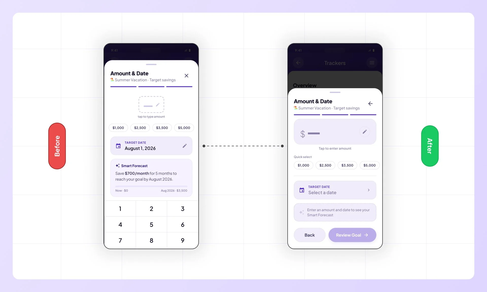
• The Amount & Date screen in Flow 02 was overloaded — one participant failed the task entirely due to the layout (split into guided sub-steps with a keypad entry state).
• The Insights landing screen defaulted to a bar chart that participants skipped past without engaging (redesigned as a stat strip with a direct Dining Focus CTA).
Iterations:
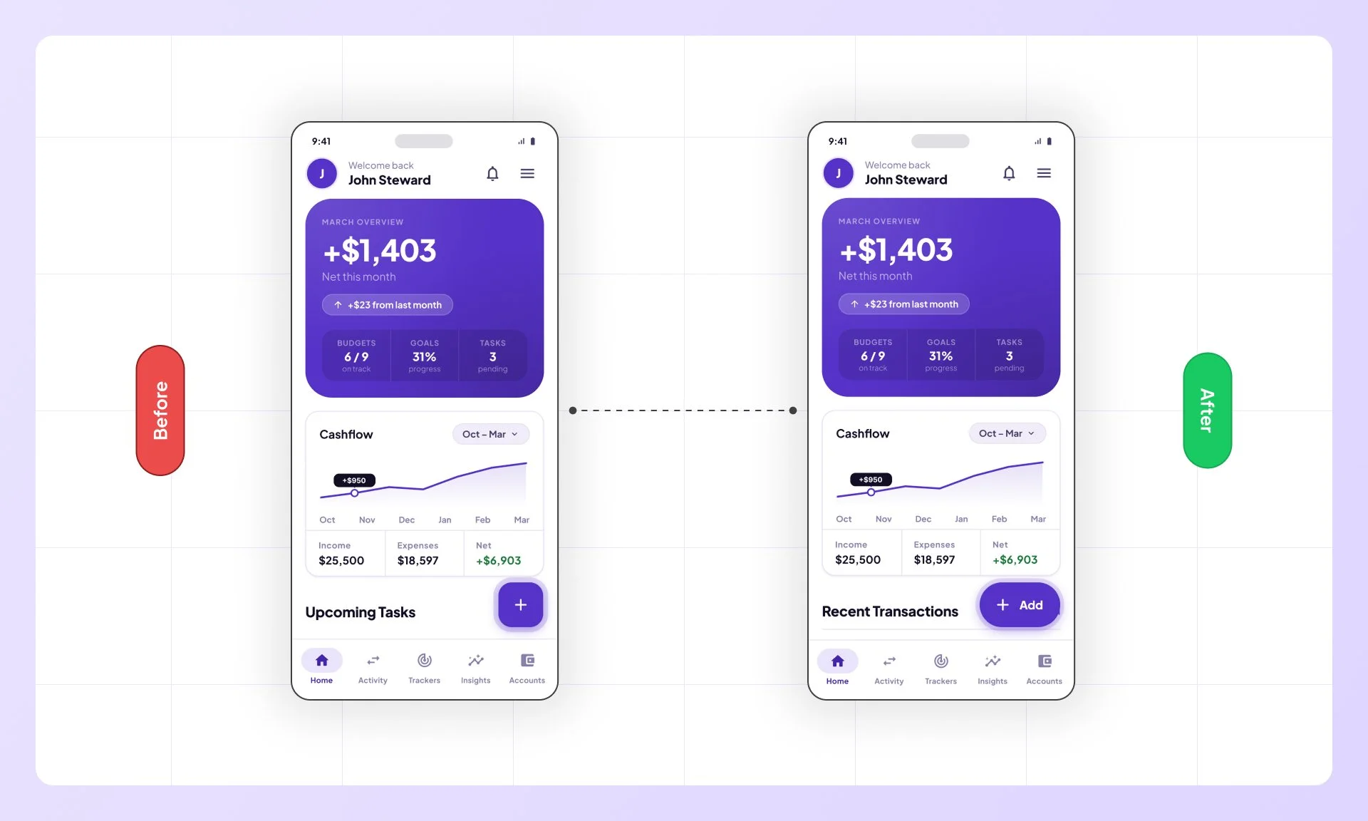
Update Fab
Heatmap data showed the circular FAB getting lost in Home screen noise; 21 clicks before participants committed to an action. It was replaced with an extended pill button labelled "+ Add", giving it clear affordance that didn't require users to guess its function.
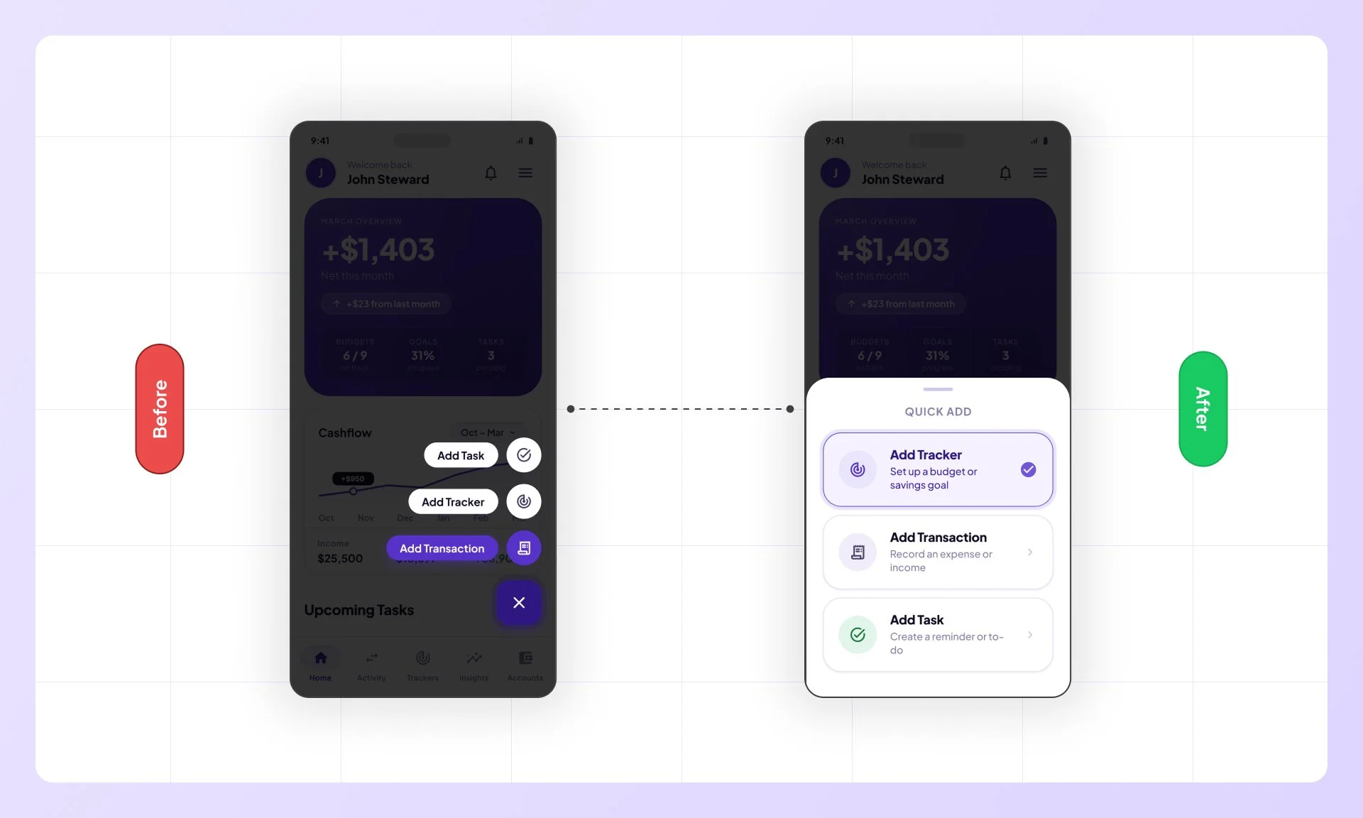
Design a new quick add sheet
All three options truncated to "Add Tr..." at the same point, causing wrong taps across both flows. Labels were expanded with distinct descriptions, eliminating the ambiguity affecting every FAB interaction in the app.
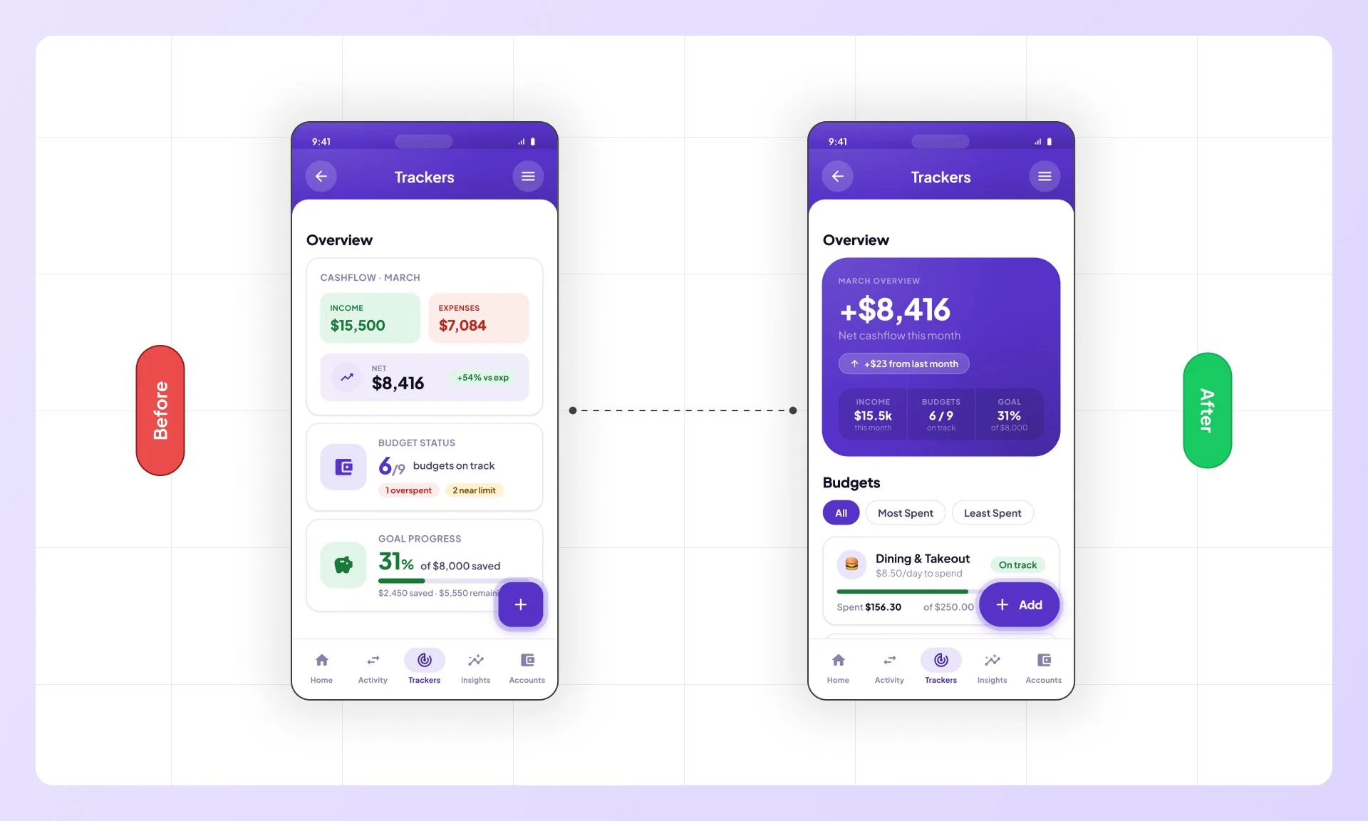
Redesign tracker overview
Three disconnected white cards broke the visual rhythm of the Home screen. Replaced with a single unified purple overview card, creating consistency across both primary screens.
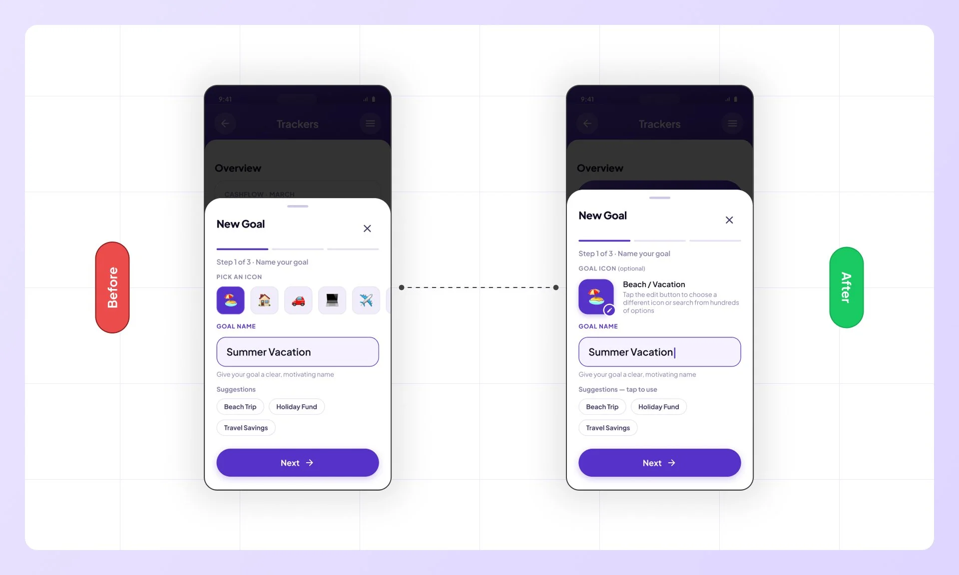
Redesign icon selection
Two participants flagged the mandatory icon picker as unnecessary friction. The field was made optional, removing a forced step that added cost without contributing to the core task.
Simplify the amount & date sheet
At 52 clicks against 13 mapped interactions, this was the most friction-dense screen in the study. Competing input methods were consolidated into a single clean flow, resolving the study's only task failure.
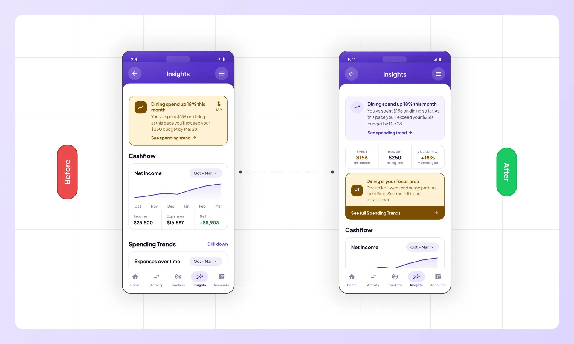
Redesign insights page layout
Two participants felt the path to spending detail had one step too many. The Insights page was restructured to lead with a summary view, making drill-down a secondary action.
Building a design system
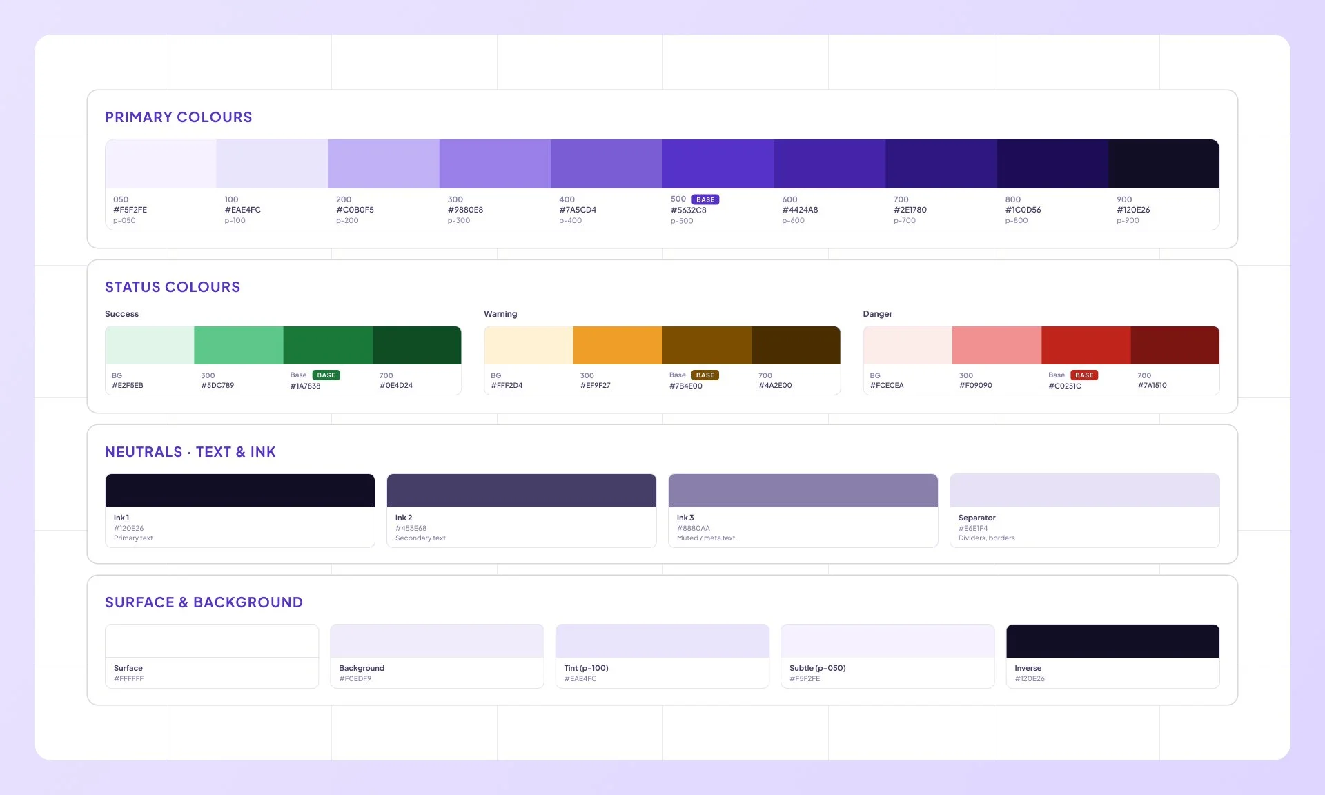
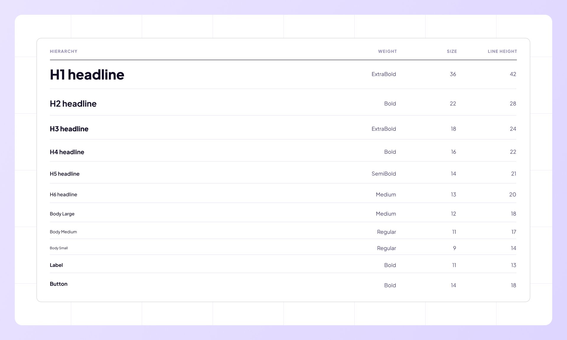
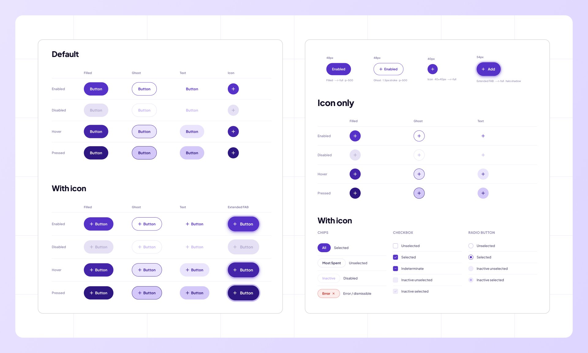
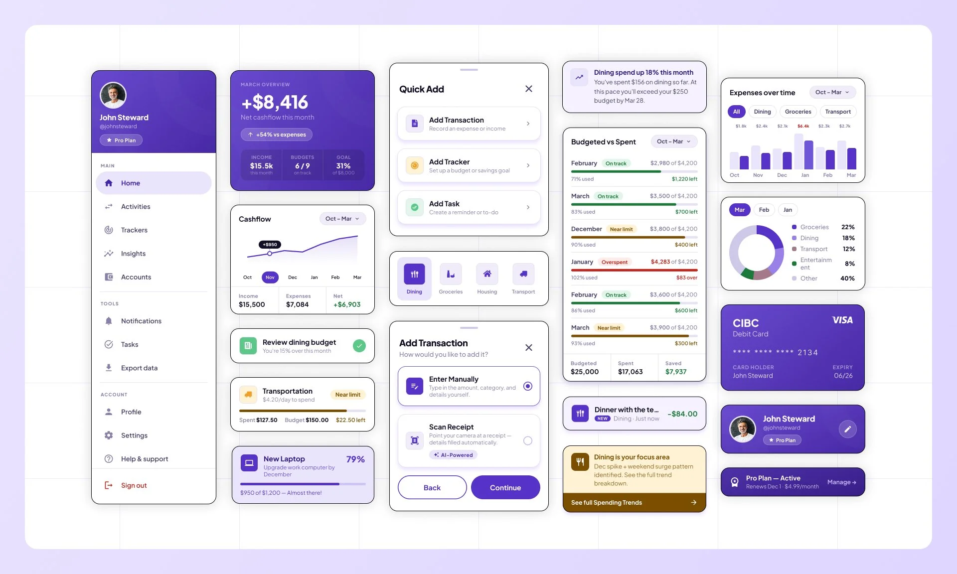
A dedicated design system was built in Figma covering colours, typography, buttons, and components — used as the single source of truth across all screens.
Final Designs
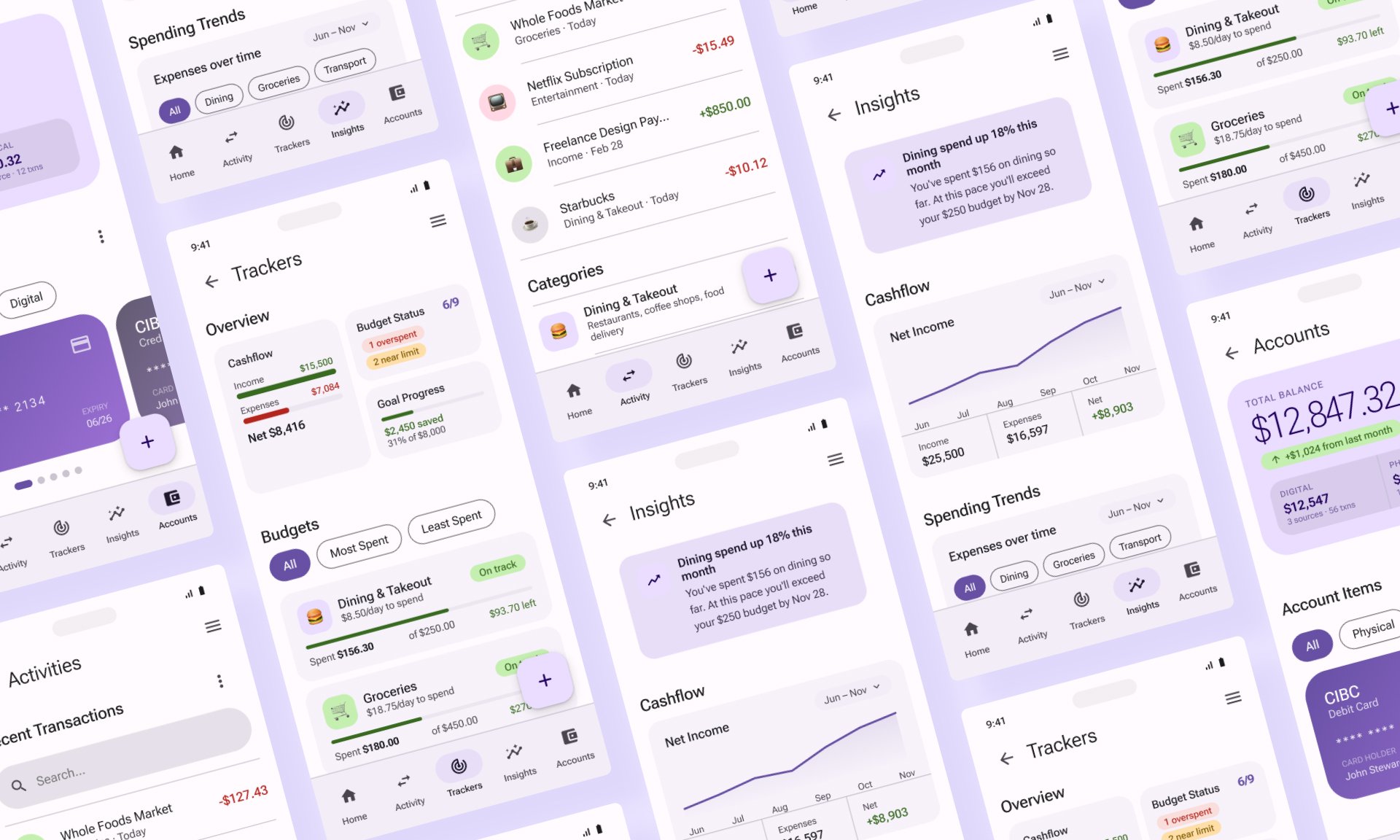
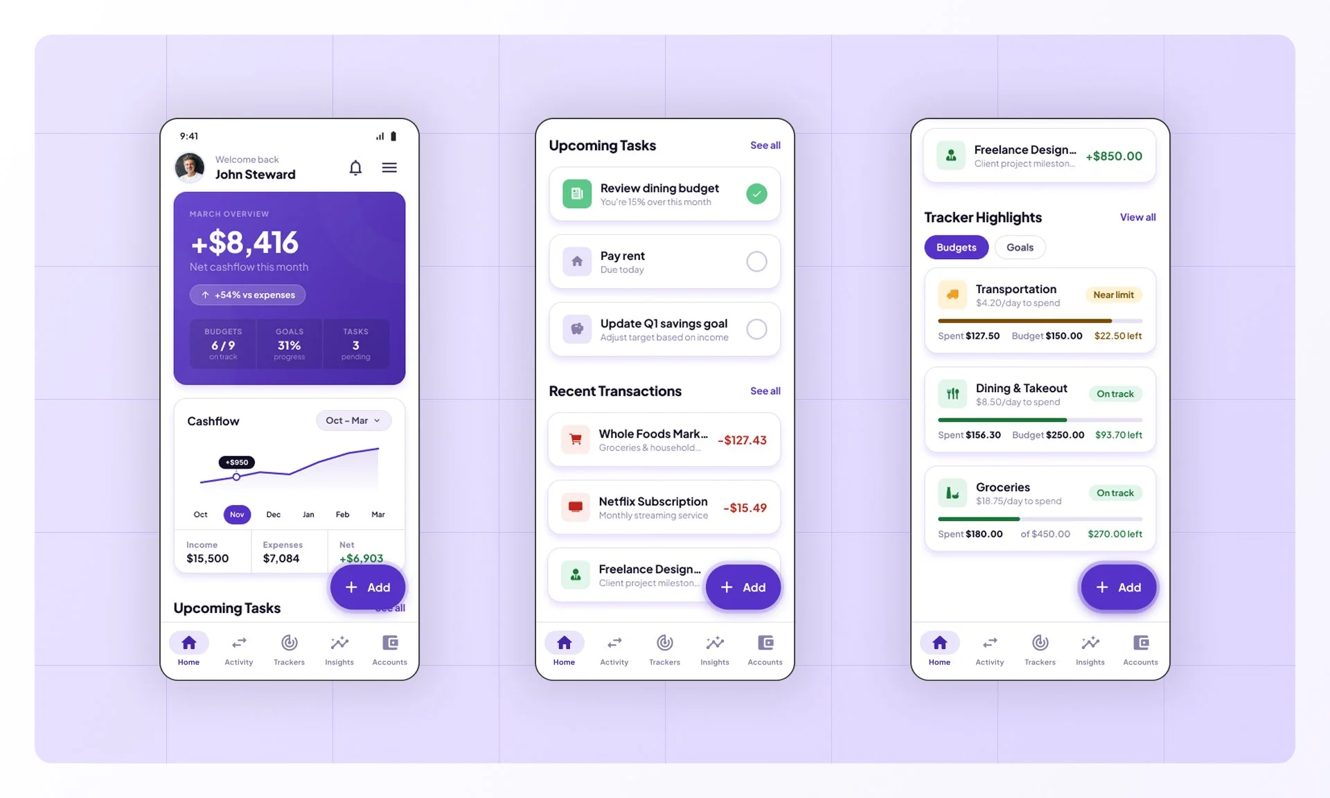
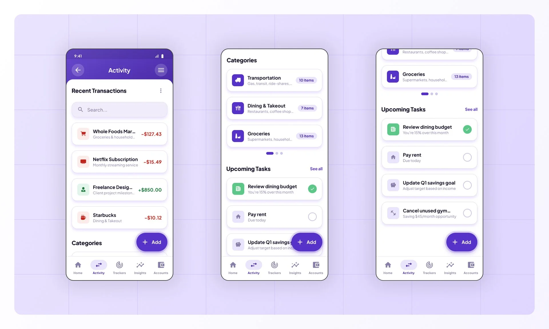
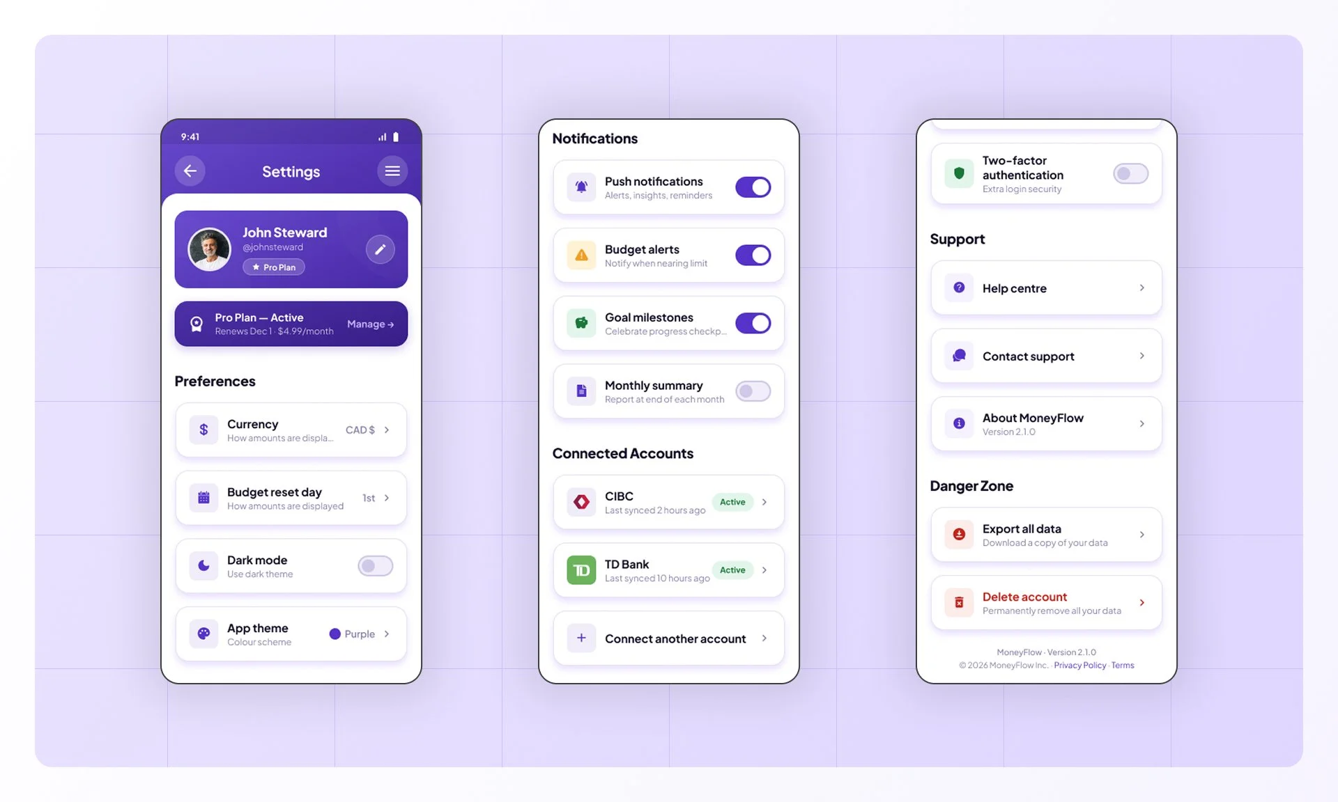
With the design system in place and iterations applied, all four flows were brought to high-fidelity — translating research findings and usability feedback into a polished, high-quality design.
Main Screens:
Flow 01 - Add transaction:
Flow 02 - Set A Goal:
Flow 03 - View Insights:
Flow 04 - Budget Exceeded:
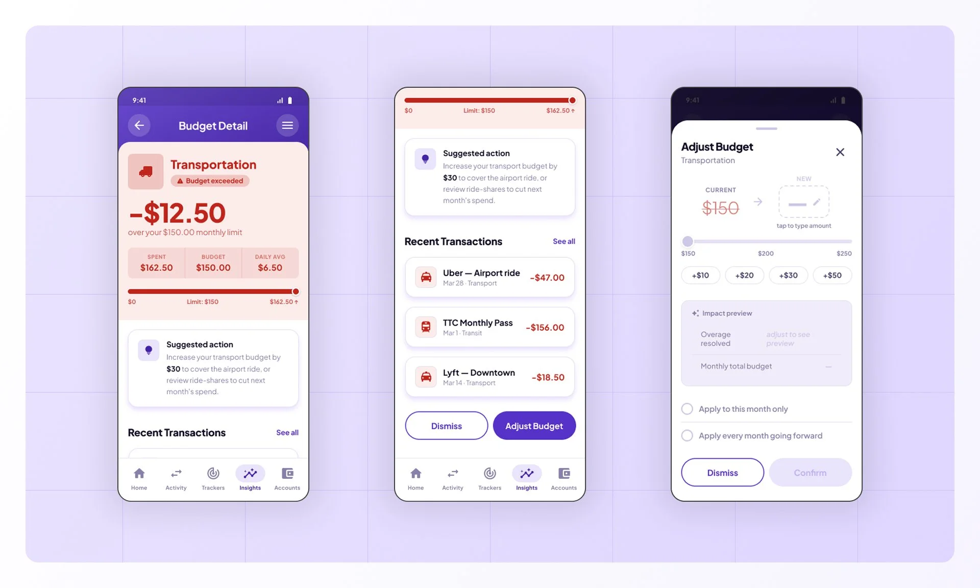
IMPACT and RESULTS
MoneyFlow's first usability study returned encouraging results across all four flows — with friction concentrated in specific, addressable areas rather than spread across the system.

Task Completion
95%
19 of 20 tasks completed across all four flows

Ease Score
6.6 / 7
Highest-rated flow — Respond to a Budget Alert

Sus Score
78.75
Adjusted mean excluding prototype outlier session
Design Outcomes:




Design System
Created a cohesive design system with 40+ components
Hi-Fi Screens
Designed 46 high-fidelity screens covering all four user flows
Prototype
Delivered interactive prototype for stakeholder buy-in
Accessibility
Documented accessibility considerations (WCAG AA compliant)
User Reviews:

"The alerts catch your overspending before it becomes a problem; exactly what a finance app should do."
— Participant 01

"It doesn't just show you the numbers; it actually tells you what's driving them."
— Participant 02

"The budget alert walked me straight through fixing the issue; the whole thing took seconds."
— Participant 03